


")
Valentine’s Table Decor: 10 Fresh Color Palettes Beyond Red (and How to Style Each One)
Valentine’s Day table decor doesn’t have to default to “everything red, everything heart-shaped.” The most modern, photo-worthy tablescapes right now lean into unexpected color stories—still romantic, still celebratory, but with more personality, texture, and depth.
This guide gives you 10 trend-forward palettes beyond classic red, plus practical styling formulas so you can build a cohesive table without overthinking every detail. Whether you’re planning a candlelit dinner for two, a Galentine’s brunch, or a full-on dinner party, you’ll walk away with a palette that feels current—and a table that looks professionally styled.
The secret to a “designer” Valentine’s table: the 60/30/10 color rule
Before we get into palettes, here’s the easiest way to make any color combo look intentional:
- 60% Base: tablecloth/runner + plates (your “canvas”)
- 30% Secondary: napkins + florals (your “story”)
- 10% Accent: candles + place cards + small pops (your “spark”)
When you stick to this ratio, even bold colors feel balanced—and your table photographs beautifully.
What makes a Valentine palette feel romantic (even without red)?
Romance is more about mood than a single color. You can create that mood with:
- Warm lighting: taper candles, tea lights, or low-glow lamps
- Tactile textures: velvet ribbons, linen napkins, ruffled runners, glazed ceramics
- A focal moment: a centerpiece runner, candle cluster, or floral installation
- Thoughtful details: place cards, menus, a small favor at each setting
Now—let’s choose your palette.
1) Cherry + Chocolate: playful romance with a “dessert bar” vibe
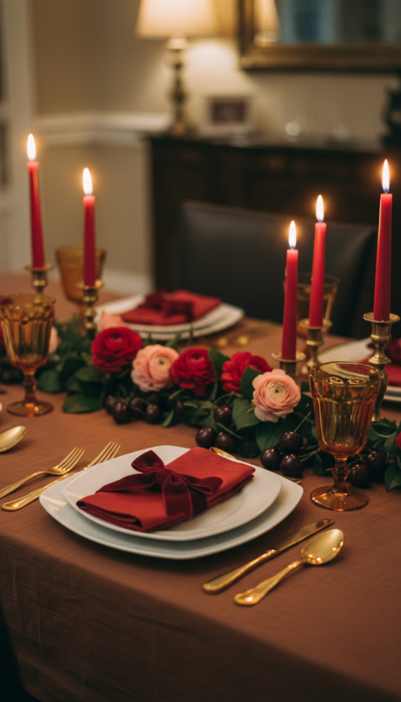
If you still want a Valentine nod without going traditional, cherry tones feel flirty and modern, especially when grounded with chocolatey browns. (Cherry shades have been called out as a standout trend color story in recent Pinterest forecasting.)
Use this palette if: you love cozy, rich, slightly retro vibes.
Style it like this
- Base: cocoa tablecloth or deep taupe runner
- Secondary: cherry-toned napkins or glassware
- Accent: gold flatware + warm amber candles
Centerpiece idea
- A low fruit-and-flower runner: cherries (real or faux), ranunculus, tulips, and a few glossy leaves.
Pro tip: Add one “wink” detail—a bow on each napkin or cherry-themed place cards.
2) Butter Yellow + Blush + Cream: soft, optimistic, and very “brunch-ready”
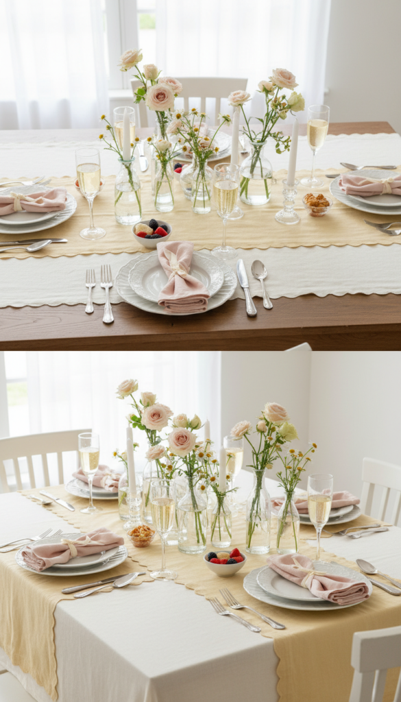
Butter yellow reads warm, happy, and fresh—perfect if you’re hosting daytime. It’s also been highlighted as a trending color direction in Pinterest’s annual palette reporting.
Use this palette if: you want romantic, but airy—not moody.
Style it like this
- Base: cream tablecloth with a butter-yellow runner
- Secondary: blush napkins + pale pink florals
- Accent: clear or pearlized candle holders
Centerpiece idea
- A bud-vase lineup (7–12 small vases) with pale roses, carnations, chamomile, and greenery.
Elevate it: Use scalloped edges (napkins, placemats, menus) to give a sweet coquette finish.
3) Aura Indigo + Rose + Silver: cool-toned romance that looks editorial
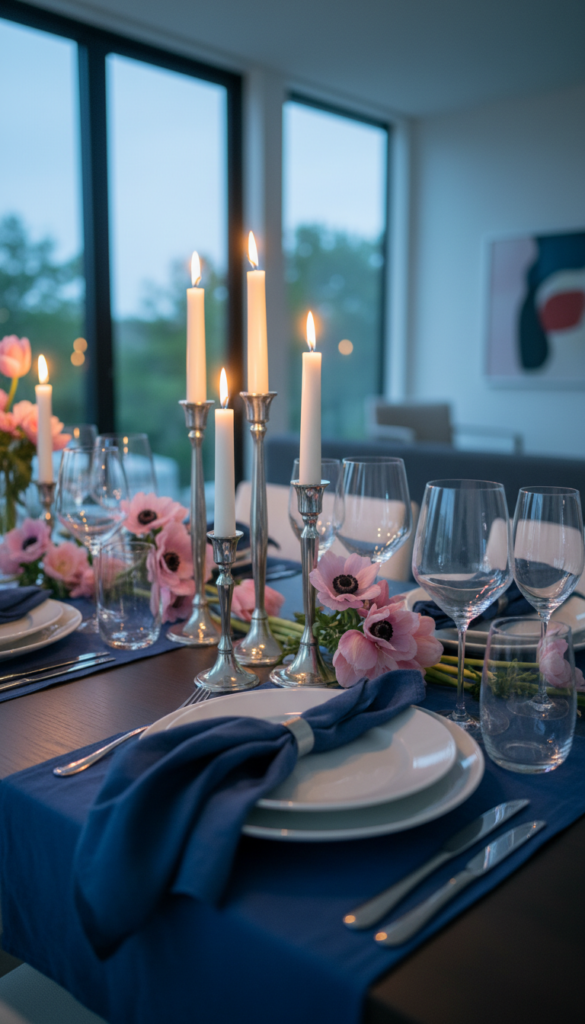
Want something unexpected that still feels luxe? Pair a deep, dreamy indigo with soft rose tones and silver accents. (Aura Indigo has also been featured among Pinterest’s forecasted trending colors.)
Use this palette if: your style leans modern, chic, and slightly dramatic.
Style it like this
- Base: white plates + indigo napkins
- Secondary: pink florals (anemones, tulips, roses)
- Accent: silver candlesticks + crystal glassware
Centerpiece idea
- A candle-first tablescape: cluster tapers of different heights, then tuck flowers between.
Pro tip: Add a handwritten menu card in black ink on soft white stock—it sharpens the whole look.
4) Dill Green + Pink + Brass: garden romance with personality
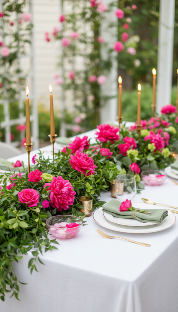
Green instantly makes a table feel alive. A fresh dill-toned green paired with pink and brass reads “romantic garden party,” even indoors. (Dill Green appears in Pinterest’s reported trending palette colors.)
Use this palette if: you want floral-forward, fresh, and lively.
Style it like this
- Base: crisp white linen
- Secondary: green napkins + pink florals
- Accent: brass candleholders + gold-rimmed glasses
Centerpiece idea
- A greenery runner (eucalyptus, ruscus) with pink blooms woven through.
Make it feel expensive: Keep the pinks in one family (all blush, or all hot pink) rather than mixing too many.
5) Alpine Oat + Ballet Pink + Copper: warm neutral romance (but not “minimal”)
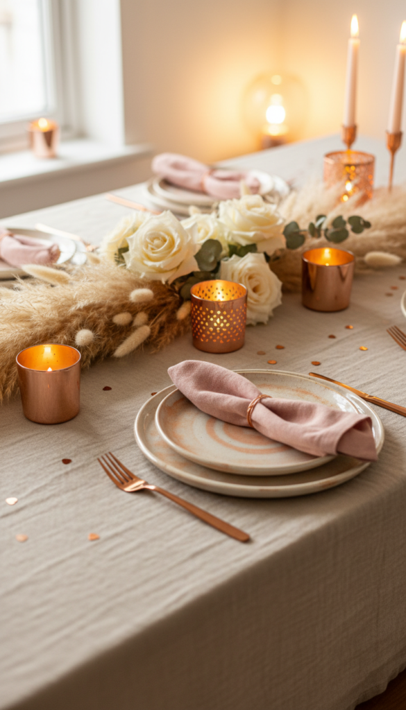
This palette is proof neutrals can still feel Valentine’s—especially when you add blush and copper glow. (Alpine Oat has also been listed among Pinterest’s featured trending hues.)
Use this palette if: you like warm, modern, softly layered styling.
Style it like this
- Base: oatmeal-toned cloth or woven placemats
- Secondary: blush napkins + creamy florals
- Accent: copper votives + warm tea lights
Centerpiece idea
- Pampas + roses: a low dried-and-fresh mix that holds up all evening.
Pro tip: Choose plates with a reactive glaze or handmade edge—texture is what keeps this from feeling flat.
6) Black + Rose + Gold: “moody luxe” for a dramatic dinner party
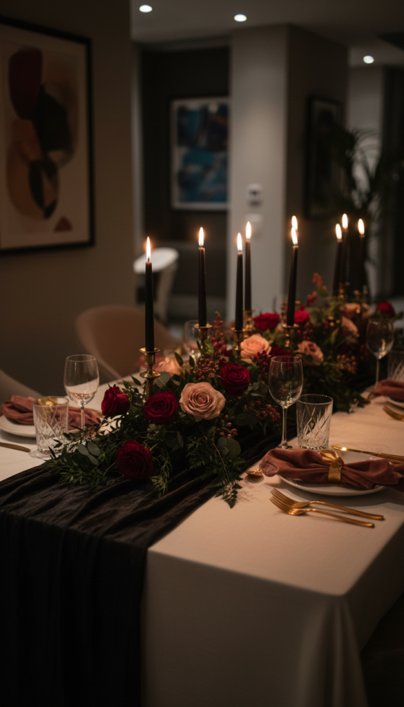
Black instantly makes the table feel grown-up and cinematic. Add rose tones and gold, and you get high-impact romance—perfect for evening hosting.
Use this palette if: you love candlelight, drama, and bold contrast.
Style it like this
- Base: black runner (even on a white tablecloth)
- Secondary: deep pink napkins + red/rose florals
- Accent: gold flatware + tall tapers
Centerpiece idea
- One long floral line down the center, kept low so guests can still talk across the table.
Hosting tip: With black, lighting matters. Use more candles than you think—it softens the contrast and looks incredible in photos.
7) Plum + Pomegranate + Champagne: rich, romantic, and winter-perfect
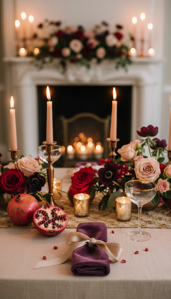
If classic red feels too literal, shift into berry territory—plum, pomegranate, wine, and champagne tones. It’s romantic, elevated, and seasonally flattering.
Use this palette if: you want romance that feels sophisticated, not kitschy.
Style it like this
- Base: ivory or champagne linen
- Secondary: plum napkins + berry florals
- Accent: champagne coupes + warm metallic candles
Centerpiece idea
- Pomegranate scatter + roses: cut a few pomegranates and let the jewel tones do the work.
Pro tip: A little velvet ribbon on napkins makes this palette feel instantly luxe.
8) Coral + Citrus Pink + Tangerine: bold “dopamine” Valentine’s (fun, not childish)
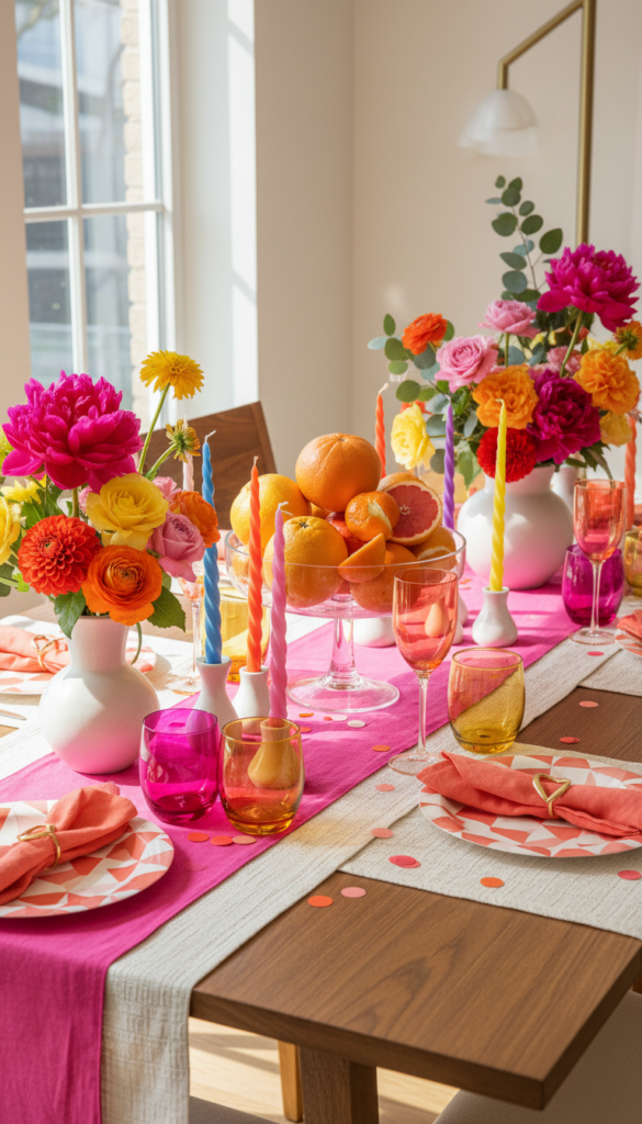
This is the palette for a lively Galentine’s—bright, energetic, and modern.
Use this palette if: you want your table to feel like a party the moment guests walk in.
Style it like this
- Base: hot pink runner on a neutral cloth
- Secondary: coral napkins + mixed bright florals
- Accent: colorful glassware + playful candle colors
Centerpiece idea
- Citrus bowls + florals: stack oranges and grapefruits in a compote bowl, then add flowers around the base.
Make it feel polished: Limit yourself to three bright tones max and repeat them evenly across the table.
9) Powder Blue + Blush + Pearl: dreamy, romantic, and unexpectedly Valentine’s
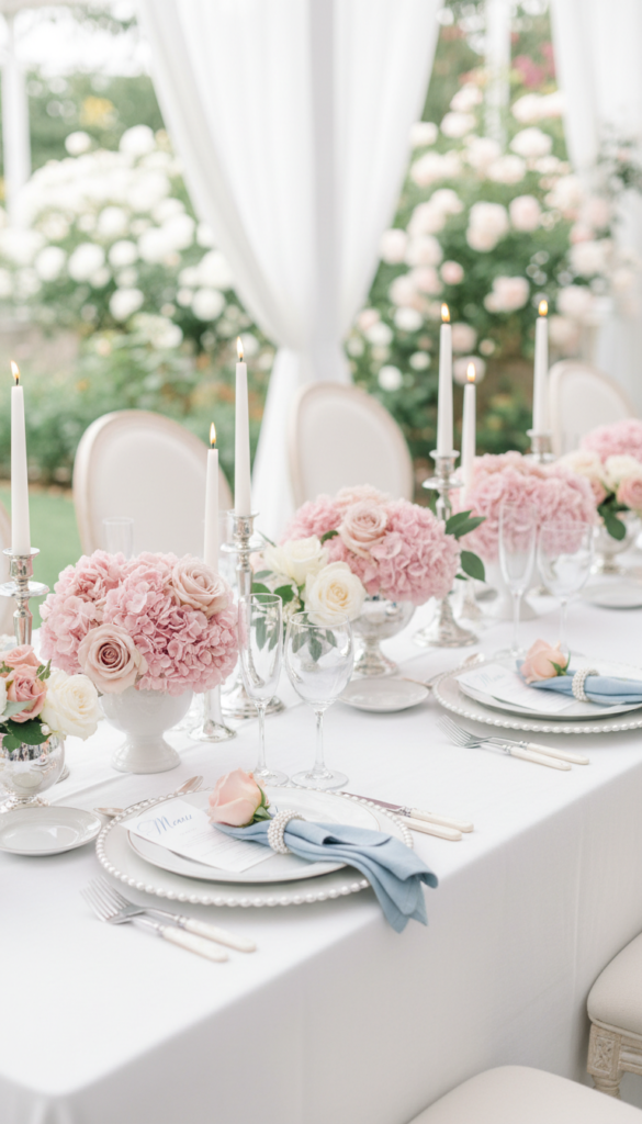
Blue can absolutely be romantic—especially pale, powdery tones paired with blush and pearly whites.
Use this palette if: you want soft romance that feels fresh and different.
Style it like this
- Base: white tablecloth
- Secondary: powder-blue napkins + blush florals
- Accent: pearl beaded napkin rings + clear candle holders
Centerpiece idea
- Hydrangea + roses (or faux hydrangea if you want it to last): big impact, soft feel.
Pro tip: Use white candles only here—colored candles can pull it off-course.
10) Mocha + Rose + Cream: cozy romance with modern “quiet luxury” warmth
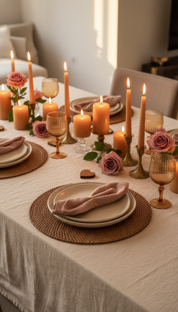
Brown tones are having a major moment in lifestyle and design, and they translate beautifully to a Valentine’s table when paired with rose and cream. (Pantone’s 2025 Color of the Year, “Mocha Mousse,” underscores that warm-brown direction.)
Use this palette if: you want cozy, modern romance that feels current.
Style it like this
- Base: cream cloth + mocha charger plates or placemats
- Secondary: dusty rose napkins + creamy florals
- Accent: amber glassware + caramel-toned candles
Centerpiece idea
- Candle clusters in warm neutrals with a few roses tucked in—simple, expensive-looking, and extremely photogenic.
The “shopping list” that works with every palette
If you want to build a table efficiently, focus on pieces that carry the color story:
Table foundation
- Tablecloth or runner
- Placemats or chargers
- Dinner plates + salad plates
Color and texture
- Cloth napkins (choose one statement color)
- Ribbon or napkin rings (bows are a high-impact upgrade)
- A centerpiece base (tray, garland, compote bowl, or bud vases)
Mood makers
- Taper candles + holders (2–3 heights)
- Votives/tea lights (for glow)
- Dim lighting or warm bulbs
Finishing details
- Place cards (handwritten always wins)
- Menus (optional but elevated)
- A small favor (chocolate, a mini bouquet, a wrapped cookie)
How to pick the right palette for your space (fast)
Use this quick decision guide:
- Look at your dining room lighting
- Warm light? Browns, blush, berries, golds will glow.
- Cool light? Indigo, powder blue, silver will look crisp.
- Start with your plates
- White plates = any palette works.
- Patterned plates = pull 1–2 colors from the pattern and build around them.
- Choose your “hero” element
- If you love florals: make flowers your 30%.
- If you love candlelight: make candles your 30% and keep florals lower.
- Keep accents consistent
- Pick one metal (gold, brass, silver, copper) and repeat it.
Final styling tip: make one “photo moment” per table
If you want your table to feel like it belongs in a magazine, create one intentional focal point:
- A center runner of flowers and candles
- A bow moment at each place setting
- A menu + place card pairing with coordinated typography
- A signature drink station that matches the palette
That single “moment” makes the entire table feel designed—without adding clutter.
Conclusion: choose a palette, then repeat it with confidence
The best Valentine’s table decor doesn’t come from buying more—it comes from choosing a color story and repeating it across linens, florals, candles, and details. Pick one of the palettes above, stick to the 60/30/10 rule, and let lighting + texture do the rest.
If you want, I can turn your chosen palette into a complete tablescape plan (shopping checklist + centerpiece recipe + place setting formula) based on your guest count and whether you’re hosting brunch or dinner.
Other Articles
")
12 Valentine’s Table Decor Ideas That Feel Cozy & Romantic
Small Bathroom Ideas (Renter-Friendly + No-Drill + Removable)
")


No Comment! Be the first one.