


")
Curtains act as the eyebrows of a room, framing the view and anchoring the design scheme. In a bedroom, where atmosphere and relaxation are paramount, the wrong color choice can disrupt the visual balance or negatively impact sleep quality. Selecting drapery requires more than simply picking a favorite shade; it demands an understanding of light, spatial perception, and color theory.
Many homeowners inadvertently shrink their space or create visual chaos by overlooking how fabric interacts with existing elements like wall paint and flooring. These common design errors are easily preventable with strategic planning. By prioritizing undertones, lighting conditions, and material textures, you can ensure your window treatments elevate the sanctuary rather than detract from it.
Exact Wall Color Matching

A common misconception is that matching curtains perfectly to the wall color creates a seamless look. While monochromatic schemes are stylish, choosing the exact same shade without variation often results in a ‘box effect,’ making the room feel flat and uninspired. This lack of contrast causes the architectural details of the window to disappear into the background.
Instead of an identical match, opt for a tone-on-tone approach. Select a curtain color that is either two shades lighter or darker than the wall paint. This subtle difference adds depth and dimension while maintaining a cohesive aesthetic. If the walls are a warm beige, consider curtains in a rich taupe or a soft cream to break up the visual monotony.
Pro Tip: If you must match the color exactly, focus on texture. Use a highly textured fabric like heavy linen or velvet to differentiate the curtains from the flat drywall.
Conflicting Undertones

Colors are rarely neutral; they carry underlying warm (yellow, red, orange) or cool (blue, green, purple) tones. A major error involves mixing a warm-toned wall color with cool-toned curtains, or vice versa. For example, pairing ‘cool grey’ curtains with ‘warm cream’ walls can make the walls look dingy or the curtains appear cheap.
Identify the dominant undertone of your room’s fixed elements—flooring, carpet, and paint—before shopping. If your grey walls have a blue undertone, stick to silver or icy blue drapery. If the grey leans towards greige or brown, earthy tones will harmonize better. Consistency in color temperature is critical for a polished, professional finish.
Pro Tip: Place a sheet of pure white paper next to your paint and fabric samples. This comparison will instantly reveal the hidden undertones that might not be obvious at first glance.
Disregarding Room Proportions
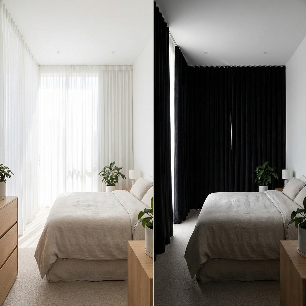
Color has a profound impact on the perception of space. Installing heavy, dark curtains in a small bedroom can make the area feel claustrophobic and cave-like. While dark colors add drama, they visually advance, meaning they appear closer to the viewer than they actually are, effectively shrinking the room.
For compact bedrooms, lighter hues or fabrics close to the wall color are superior choices as they reflect light and expand the visual field. Reserve deep navy, emerald, or black curtains for larger master suites where the space can handle the visual weight without feeling constricted. If you desire dark blackout curtains in a small room, ensure they are pulled completely back during the day to maximize daylight.
Pro Tip: To mitigate the shrinking effect of dark curtains, hang the rod as high as possible—closer to the ceiling than the window frame—to draw the eye upward and create an illusion of height.
Neglecting Artificial Lighting Effects

Drapery fabric looks significantly different under showroom lighting compared to the warm glow of bedside lamps or the blue hue of daylight LED bulbs. A fabric that appears to be a rich olive green in the store might turn mud-brown under soft white residential lighting at night.
Lighting temperature (measured in Kelvin) alters color rendering. Incandescent bulbs intensify warm colors but dull cool tones, while daylight bulbs make blues pop but can wash out warmer shades. Failing to account for how your specific bedroom lighting interacts with the fabric often leads to disappointment once the curtains are hung.
Pro Tip: Always view fabric swatches in the bedroom at three distinct times: morning (natural light), afternoon (indirect light), and night (artificial light).
Isolating Curtains from Bedding

The bed is typically the largest piece of furniture in the room, and the window treatments are the largest vertical element. Treating these two features as separate entities often results in a disjointed design. If the bedding features a bold, busy pattern, choosing curtains with a conflicting pattern or clashing color creates visual chaos.
Balance is key. If the duvet cover is patterned, pull a solid color from that pattern for the curtains. Conversely, if the bedding is neutral solid, the curtains can serve as the focal point with a bolder color or print. They do not need to match perfectly, but they must converse comfortably within the same color family.
Pro Tip: Follow the 60-30-10 rule. Let the walls be the dominant 60%, the bedding the secondary 30%, and use the curtains (or vice versa) as the accent 10% or part of the secondary block.
Ignoring Fabric Sheen Impact

The finish of the fabric affects how the color is perceived. High-sheen fabrics like silk, satin, or shiny polyester reflect light, which can make colors appear lighter or change tint depending on the viewing angle. Matte fabrics like cotton, linen, and velvet absorb light, presenting a truer, deeper representation of the color.
In a bedroom, highly reflective curtains can sometimes look dated or overly formal if not styled correctly. They also tend to highlight wrinkles and imperfections in the drape. Matte finishes generally offer a more modern, relaxed, and sophisticated aesthetic that blends well with contemporary bedroom furniture.
Pro Tip: For a luxurious look that isn’t overly shiny, opt for velvet. It absorbs light to provide deep, saturated color without the glare of satin.
Overlooking Exterior Appearance

Curtains impact the exterior curb appeal of your home just as much as the interior design. Hanging bright neon or patterned curtains might look fun inside, but they can create a jarring, mismatched look from the street, especially if different rooms show different colors.
Most homeowners associations and design standards recommend a uniform look from the outside. This doesn’t mean you are limited to white curtains in every room. Simply choose lined curtains where the face fabric matches your bedroom decor, but the lining (the side facing the window) is white or off-white. This ensures consistent curb appeal while allowing for personal expression inside.
Pro Tip: Invest in double-lined or blackout curtains. These usually come with a neutral backing automatically, solving the exterior color issue while providing superior light control for sleep.
Forgetting the Function of Dark Colors

While light, airy curtains are aesthetically pleasing, they often fail at the primary function of bedroom window treatments: light control. Choosing a pale, unlined curtain fabric can result in streetlights or early morning sun intruding on sleep. Light colors naturally filter less light than dark colors unless heavily lined.
However, dark colors absorb heat. If your window faces west and gets intense afternoon sun, dark curtains can act as a heat radiator, warming up the room uncomfortably. Balancing the functional needs of light blocking and heat management is crucial when selecting the color depth.
Pro Tip: If you love the look of light colored curtains but need darkness, use a ‘French Return’ rod and a high-quality blackout liner. This gives the aesthetic of light curtains with the functionality of dark ones.
Skipping the Swatch Test

Perhaps the single biggest mistake is buying curtains based solely on a digital image or a small in-store sample without testing it in the actual space. Online product photos are often color-corrected or staged in studios with lighting that does not match residential reality. A ‘burnt orange’ on a screen might arrive as a bright ‘traffic cone orange.’
Always order physical swatches before committing to the full purchase. Tape the swatch to the wall next to the window and leave it there for a few days. Observe how it looks when the sun hits it directly versus when the room is in shadow. This small step prevents the hassle of returning heavy, expensive drapery.
Pro Tip: When testing swatches, stand back at least five feet. Viewing the fabric from a distance gives a better impression of how the color reads in the context of the whole room.
Conclusion
Curtain color selection is a balancing act between aesthetics and practicality. By avoiding these common pitfalls—such as ignoring undertones, neglecting lighting conditions, and forgetting the exterior view—you can select window treatments that finish your bedroom with sophistication. The right color choice does more than cover a window; it unifies the decor, enhances the perception of space, and creates the restful atmosphere essential for a good night’s sleep. Take the time to test samples and consider the room’s entire palette to achieve a designer-level result.
Other Articles
")
Kids Bedroom Window Treatments: Safety, Blackout & Stylish Ideas
12 Bedroom Window Treatments (Modern, Cozy & Budget-Friendly)
")


")