


15 Earthy Cottage Kitchen Color Recipes for a Naturally Warm Look
An earthy cottage kitchen feels like a favorite sweater in room form.
Soft, worn-in, a little imperfect, and always ready with tea and toast.
Color does most of that emotional heavy lifting.
The right palette wraps your kitchen in warmth, makes mismatched pieces feel intentional, and turns even a rental galley into a cozy little nest.
Below are 15 earthy cottage kitchen color recipes you can use like paint-by-number ideas.
Think of them as mood recipes: each one gives you a base color, supporting shades, and where to use them so your space feels naturally warm, not “fully renovated showroom.”
How Earthy Cottage Kitchen Color Recipes Work
Earthy cottage color recipes usually mix:
- A soft, grounding neutral (think oatmeal, mushroom, clay)
- A nature-inspired color (sage, moss, terracotta, forest green)
- A warm highlight or metal (brass, copper, honey, caramel tones)
The balance of these three creates that cozy, collected look.
You can apply each recipe to cabinets, walls, backsplash, textiles, or even just accessories if you feel nervous about big changes.
15 Earthy Cottage Kitchen Color Recipes for a Naturally Warm Look
1. Toasted Oatmeal, Honey Butter & Sage

This palette feels like breakfast in color form.
Think toasted oatmeal for cabinets, honey-butter cream on the walls, and soft sage on stools, textiles, or the pantry door.
It works beautifully in small cottages because the oatmeal and cream stay light, while sage adds just enough color to keep things from looking flat.
Layer in warm wood cutting boards, woven baskets, and a little olive-colored glassware for extra depth.
Try:
- Oatmeal lower cabinets
- Honey-cream walls and ceiling
- Sage island, vintage chairs, or open-shelf backing
2. Clay Terracotta, Dusty Sage & Cream
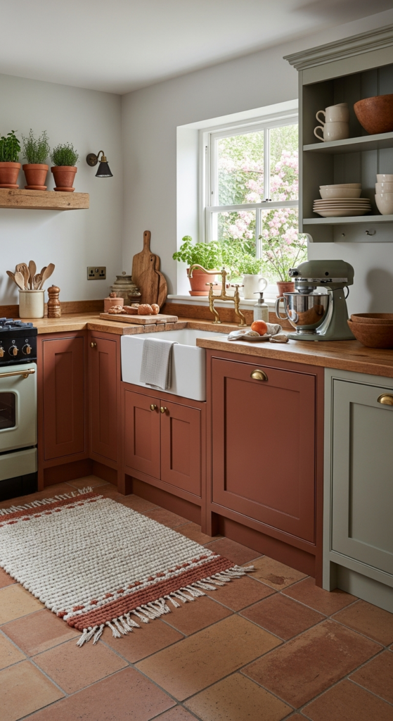
This one leans straight into that old Italian farmhouse fantasy.
Clay terracotta tiles or accents bring warmth, dusty sage cools things gently, and soft cream keeps everything airy.
Use terracotta on the floor or as a skinny backsplash border.
Paint cabinets dusty sage and keep walls cream so the room still feels bright, even on cloudy days.
To finish, add:
- Terracotta pots with herbs on the sill
- Creamy linen café curtains
- A sage-painted peg rail for mugs and aprons
3. Warm Caramel, Forest Green & Ivory
This recipe feels rich and cozy, like a cabin that reads poetry.
Warm caramel wood tones, deep forest green, and soft ivory make the kitchen feel grounded and substantial.
Paint base cabinets forest green, leave butcher block or oak counters in their natural caramel warmth, and keep upper walls ivory.
The contrast looks especially beautiful with brass hardware and warm white or Edison-style bulbs.
A few ideas:
- Forest green lower cabinets
- Ivory tile with slightly uneven, handmade edges
- Caramel-toned open shelves styled with stoneware and woven pieces
4. Soft Clay, Olive & Warm White

This palette gives a mellow, sunbaked vibe without screaming “desert.”
Think soft clay (muted rose-beige), sagey olive, and warm white.
Use warm white for walls and main cabinets, then bring in soft clay for the island or a freestanding hutch.
Olive appears on pantry doors, chair cushions, or a painted beadboard backsplash.
The look feels gentle and relaxed, especially with:
- Terracotta or clay-colored ceramics
- Olive-striped tea towels
- Woven shades on the window
5. Mushroom Taupe, Buttercream & Black Tea

This is for someone who loves neutrals but still wants warmth.
Mushroom taupe, buttercream, and a soft black tea accent create a sophisticated cottage look.
Paint cabinets mushroom taupe, use buttercream on the walls, and keep “black tea” for small anchors: curtain rods, cabinet hardware, or a metal pot rack.
The dark touches add definition without stealing the cozy feeling.
Picture:
- Mushroom cabinets with simple shaker fronts
- Buttercream tongue-and-groove backsplash
- Black-tea iron hooks, picture frames, or vintage stove
6. Burnt Orange, Putty, and Natural Oak

This palette feels like late autumn sun hitting a farmhouse table.
Burnt orange, putty beige, and natural oak create warmth, but still stay grounded and earthy.
If bright orange scares you, keep it in small doses.
Use putty on walls and cabinets, natural oak for shelves and counters, then thread burnt orange through textiles and pottery.
Try:
- Putty cabinets and walls
- Oak shelves lined with speckled ceramics
- Burnt orange striped rug, dish towels, or a painted interior of glass-front cabinets
7. Deep Plum, Warm Linen & Brushed Brass
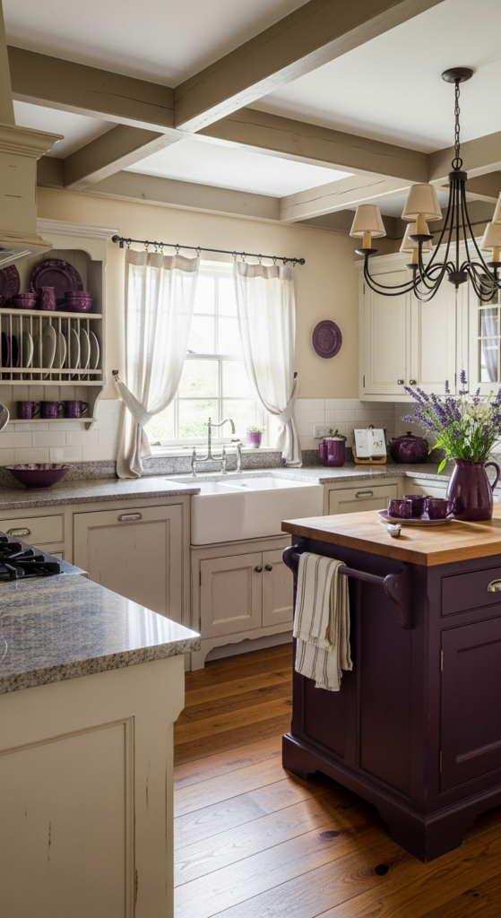
For a moody cottage kitchen with a soft glow, this combination is magic.
Deep plum, warm linen, and brushed brass feel romantic but still earthy and grounded.
Use plum sparingly but confidently: lower cabinets, island, or a built-in bench.
Keep walls and uppers in warm linen, then sprinkle in brushed brass hardware and lighting.
The effect looks especially dreamy with:
- Linen café curtains pooling slightly on the sill
- Brass cup pulls and knobs
- A bowl of figs, dark berries, or deep purple flowers on the counter
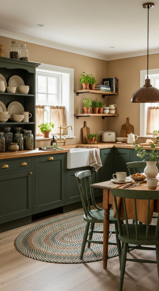
8. Moss Green, Toasted Almond & Terracotta Tile
This recipe feels like a garden kitchen wrapped in warm light.
Moss green, toasted almond, and terracotta keep the room feeling grounded and connected to nature.
Paint cabinets moss green, use toasted almond on walls or a plaster-style finish, and bring in terracotta on the floor or as a hexagon backsplash.
The mix feels timeless, especially with aged wood and vintage glass jars.
Layer in texture with:
- Terracotta plant pots on a moss-green windowsill
- Almond-colored woven seat pads
- A simple antique wood table or rolling cart
9. Sand, Wheat & Smoky Olive

This one leans soft and subtle for anyone who loves calm, neutral spaces.
Sand, wheat, and smoky olive whisper “cottage,” instead of shouting it.
Use sand on the walls, wheat on cabinets, and smoky olive on details like trim, interior doors, or stools.
The result feels like dried grasses and old stone walls.
For extra warmth:
- Hang a wheat-colored linen Roman shade
- Use smoky olive gingham napkins or cushion covers
- Style sand-colored ceramics and wood spoons in a stone crock
10. Copper Kettle, Stone Grey & Cream
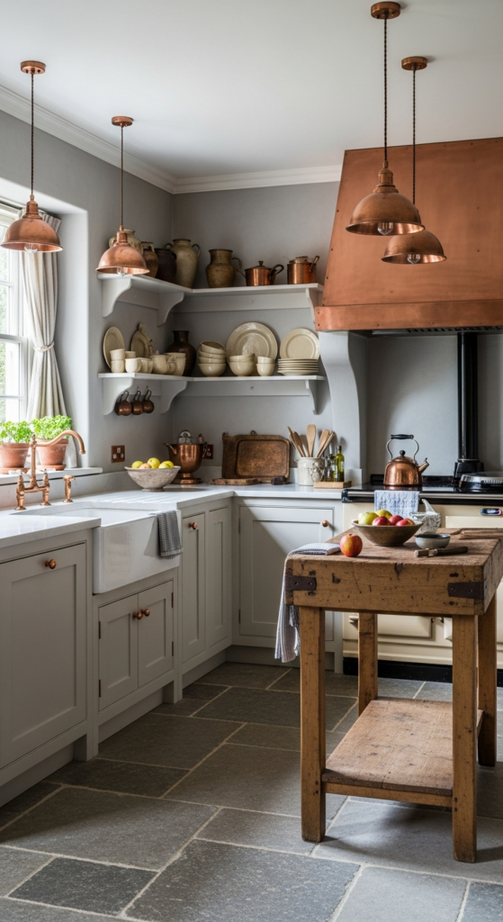
This palette lives for old pots and collected cookware.
Copper, soft stone grey, and cream give an earthy, European-cottage mood.
Keep cabinets stone grey, walls cream, and then lean fully into copper: kettles, pans, colanders, and small fixtures.
The metal reads as a warm color in the room, especially under golden light.
You can emphasize the look with:
- Cream subway tile with slightly irregular edges
- Grey cabinets with classic latches
- A row of copper pots on a rail or shelf
11. Soft Mauve, Mushroom & Aged Gold
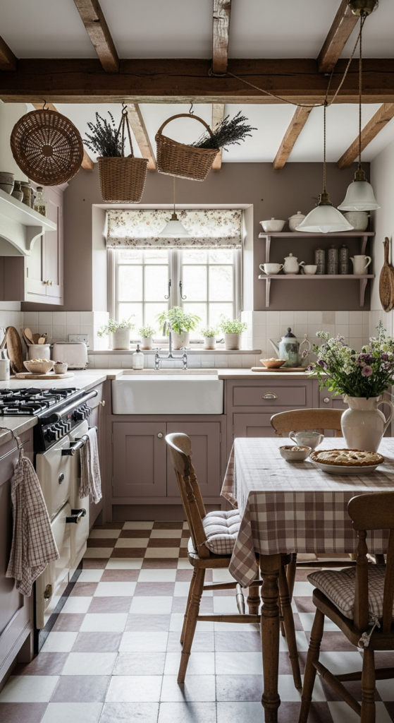
This is a gentle, romantic twist on cottage style.
Soft mauve, mushroom taupe, and aged gold create a powdery, storybook feel.
Use mushroom as your main neutral for cabinets or walls.
Bring in soft mauve on a hutch, pantry door, or painted beadboard, and keep aged gold on frames, knobs, and light fixtures.
To keep the palette grounded and not overly sweet:
- Pair with warm wood, not glossy white
- Add chunky, rustic ceramics instead of delicate china
- Use cozy textures like nubby linen or cotton instead of shiny fabrics
12. Pumpkin, Nutmeg & Creamy Latte
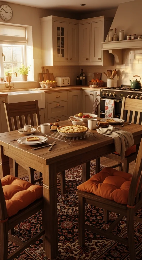
This color recipe basically smells like baking.
Pumpkin, nutmeg brown, and creamy latte create a kitchen that always feels ready for pies and soup.
Use creamy latte as your base (walls or cabinets), nutmeg on wood elements like shelves or a farmhouse table, and pumpkin as the bright, spicy accent.
Pumpkin can show up on bar stools, a painted island, or even inside open shelving.
Add to the warmth with:
- Nutmeg-toned wicker baskets
- Pumpkin-colored cushions or a small rug
- Creamy ceramic mugs lined up on a shelf
13. Sea-Salt Green, Clay Pink & Driftwood
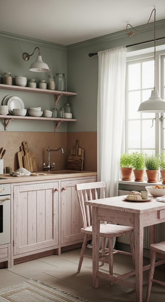
For a cottage kitchen that feels coastal but still earthy, this palette shines.
Sea-salt green, clay pink, and driftwood create a soft, weathered look.
Paint walls a pale sea-salt green, use driftwood-toned wood for shelves or counters, and bring in clay pink on small elements: flower pots, bowls, or a painted chair.
The combination feels breezy but still warm and grounded.
Details that help:
- Woven jute runner on the floor
- Clay-pink terracotta crock for utensils
- Sea-glass bottles in soft greens and browns on the windowsill
14. Charcoal, Warm Wheat & Maple Wood

This recipe is for a slightly more modern cottage feel that still stays earthy.
Charcoal, warm wheat, and maple wood deliver contrast while keeping things soft.
Use charcoal on the lower cabinets or range hood, warm wheat on the walls and uppers, and maple wood for counters or shelving.
The charcoal adds depth, while wheat and maple keep the space from feeling cold.
To keep the mood cozy:
- Add woven pendant shades over an island
- Use creamy, textured tiles instead of flat, glossy ones
- Style maple boards, lidded jars, and baskets on open shelves
15. Earthy Ochre, Chalky White & Dark Cypress

This color recipe feels bold, old-world, and deeply rooted in nature.
Earthy ochre, chalky white, and dark cypress green give a rich, cottage-with-history feeling.
Use chalky white for walls, dark cypress for cabinets or a tall pantry, and ochre as the star accent.
Ochre works beautifully on a plaster-style chimney hood, painted floor pattern, or a standout island.
For extra atmosphere:
- Dark green window trim or interior doors
- Ochre-striped linen tablecloth or runner
- Worn wood stools and dark stone or slate floor tiles
How to Choose the Right Earthy Cottage Palette for Your Kitchen
Start with what cannot realistically change: floor, counters, big appliances.
Look closely at their undertones: do they lean warm (yellow, red, brown) or cool (blue, grey)?
Match your color recipe to those undertones.
For example, warm wood floors play nicely with caramel, ochre, and forest greens, while cooler grey stone suits mushroom, moss, and soft clay tones.
Next, think about light.
A dim or north-facing kitchen usually loves lighter recipes: toasted oatmeal, buttercream, sea-salt green.
A sunny space can handle deeper shades like plum, forest, charcoal, or cypress.
Finally, decide where you feel comfortable with color.
If cabinets feel like too big a commitment, keep them neutral and use the bold shade on a pantry door, island, or beadboard.
Pro Tips for a Naturally Warm Cottage Look
1. Mix textures, not just colors
An earthy palette comes alive with natural textures: matte paint, rough linen, woven baskets, unglazed pottery, wood with visible grain.
That mix keeps the space interesting even when the colors stay soft and subtle.
2. Use warm metals
Brass, bronze, and copper act like built-in warmth.
Swap in warm-toned hardware, vintage-looking hooks, and warm metal lighting to instantly support your earthy colors.
3. Let wood be part of the palette
Your wood tones count as colors.
Maple, oak, walnut, and pine each bring their own temperature and personality, so factor them into your “recipe” instead of treating them as background.
4. Bring in real greenery
Even a tiny pot of herbs or a jar of branches makes earthy colors feel intentional.
Green leaves play well with every palette listed above and add that “lived with, loved, still in use” mood.
Common Mistakes to Avoid with Earthy Cottage Colors
Going too grey and cool
Overly cool greys can flatten the cozy feeling.
Choose greige, mushroom, or stone shades with a touch of warmth so the kitchen still feels inviting.
Using only one color everywhere
One color on walls, cabinets, and backsplash can make the room feel flat.
At minimum, aim for a base neutral, a support color, and a small accent.
Ignoring undertones
Beige can lean pink, yellow, or grey.
Green can lean blue or olive.
Sample your colors against each other so undertones complement, instead of fighting each other.
Forgetting the “lived-in” details
Earthy cottage kitchens love a bit of imperfection.
A single vintage chair, a slightly chipped crock, or mismatched mugs helps the palette feel natural, not staged.
Quick FAQ: Earthy Cottage Kitchen Color Recipes
How many colors should I use in one cottage kitchen?
A good rule: 3–5 visible colors.
That usually means one main cabinet color, one wall color, one accent color, plus the natural tones of wood and metal.
More than that can still work, just keep them soft and related, like cousins, not strangers.
Can I use white in an earthy cottage kitchen?
Absolutely.
Just lean into warm whites: cream, linen, chalky white.
Pair them with natural wood, warm metals, and an earthy accent color so the kitchen feels cozy instead of clinical.
How do I test a color recipe before committing?
Pick your palette, then:
- Get sample pots of each shade.
- Paint large swatches on different walls or boards.
- Look at them morning, afternoon, and evening.
- Place them next to your flooring, counters, and wood tones.
Keep the colors that still look beautiful beside your fixed finishes and under your actual lighting.
What if my kitchen is small?
Choose the lighter version of any recipe.
Use the deepest shade in smaller doses: stools, a single cabinet, a narrow strip of beadboard, or accessories.
Light, warm neutrals with a soft accent still deliver that earthy cottage mood without shrinking the space.
An earthy cottage kitchen does not require a full renovation.
Pick one color recipe that feels like your dream mood, start small with paint and textiles, and let the space slowly collect the rest.
Before long, you will walk in, put on the kettle, and feel that quiet, grounded naturally warm glow every single day.
Other Articles

13 Lighting Ideas to Create a Soft Glow in an Earthy Cottage Living Room


No Comment! Be the first one.