
")
")

Warm neutral kitchens never really go out of style. They strike the perfect balance between calm and character — a space that feels both grounded and glowingly alive. Whether you love creamy whites, gentle taupes, or the modern charm of greige, a warm neutral palette can make your kitchen instantly inviting while remaining timeless year after year.
Here are twelve fresh ways to bring this soft, sophisticated aesthetic to life — with real-world color tips, material pairings, and design details that make a neutral kitchen feel anything but flat.
1. Start with a Greige Foundation
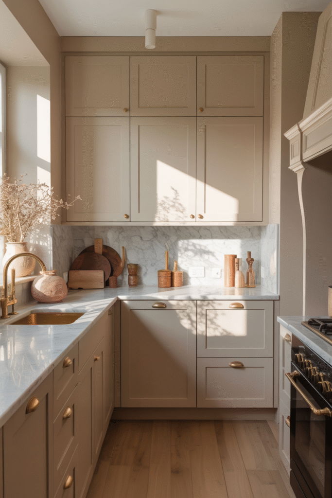
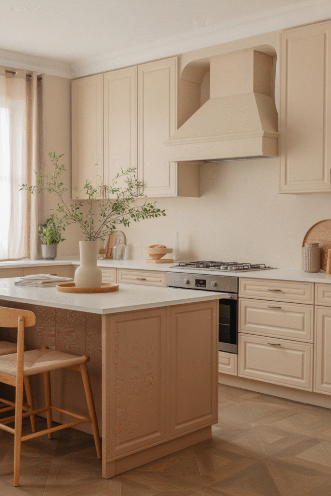
Greige — that perfect blend of gray and beige — is the quiet hero of a warm neutral kitchen. It softens modern cabinetry and pairs beautifully with both warm wood and sleek marble. Look for greiges with a subtle warm undertone (think mushroom, putty, or linen). For smaller or north-facing kitchens, choose a version with a touch of taupe to counter cool light.
2. Layer Shades of White and Cream
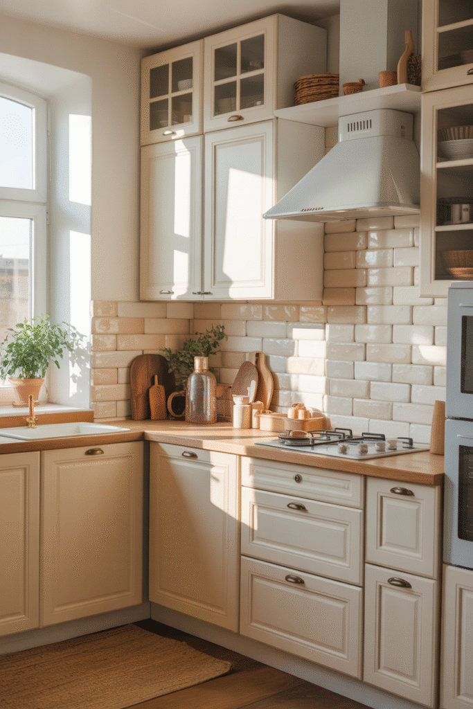
A neutral kitchen isn’t one single shade — it’s a symphony of soft tones. Mix warm whites on walls with creamier hues for cabinetry or tile. The slight contrast keeps everything from blending together. Consider pairing a creamy cabinet color with bright white countertops to create visual depth without harsh lines.
3. Bring in Natural Wood for Warmth
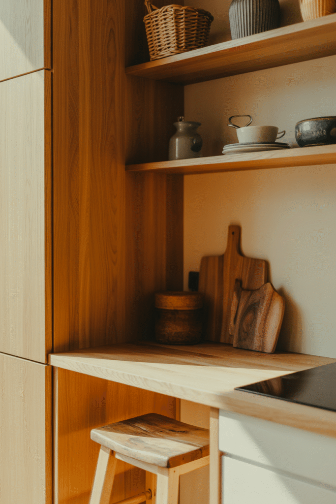
Nothing enhances a neutral palette like the organic warmth of wood. Think honey oak floors, white oak shelving, or walnut accents on an island. Mix species and finishes intentionally — a matte oak pairs beautifully with a satin walnut or maple tone. Even a single wood detail, like an open shelf or butcher-block board, helps anchor a light-toned kitchen.
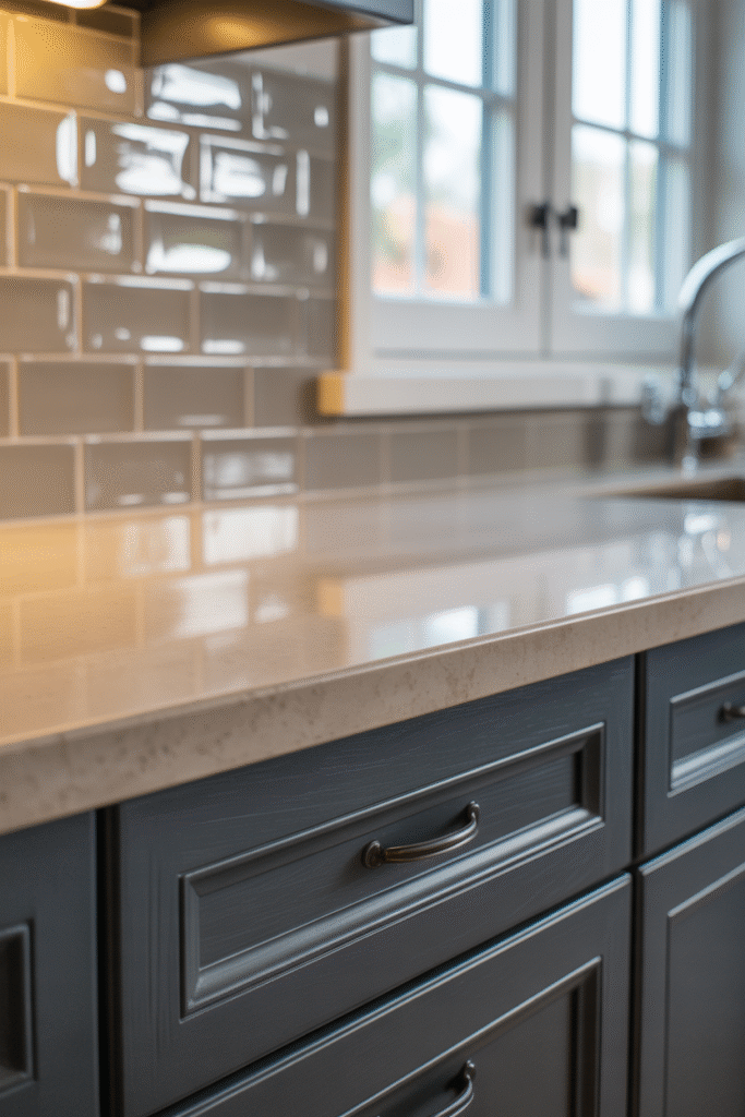
4. Choose Brass or Aged Bronze Hardware
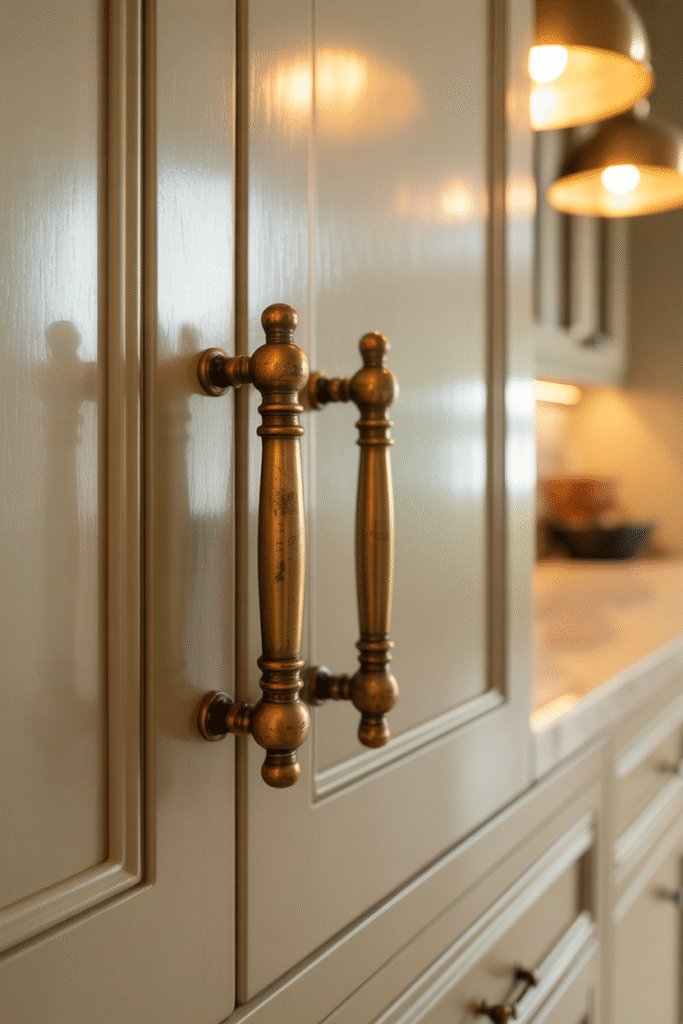
Hardware is the jewelry of your kitchen, and warm metals bring just the right amount of glow. Brushed brass, antique bronze, or unlacquered finishes age beautifully over time. To keep things cohesive, match the warmth of your metal to the undertone of your paint — creamy whites love gold, while taupes pair well with bronze or copper.
5. Add Texture Through Stone and Tile
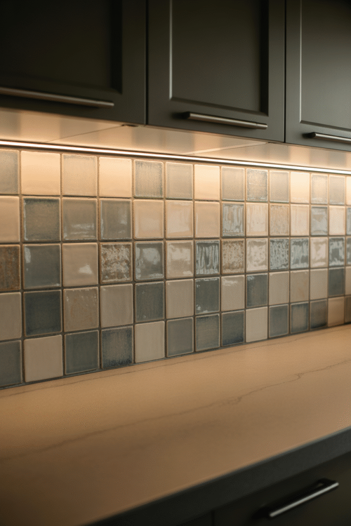
Texture prevents a neutral space from feeling sterile. A honed marble backsplash, tumbled limestone, or handmade ceramic tile adds tactile richness. Look for subtle movement in veining or variation in glaze — it’s these imperfections that make neutrals come alive. Layer in contrasting sheens too: matte cabinets, satin hardware, and glossy tile.
6. Consider the Light — Warmth Is in the Glow
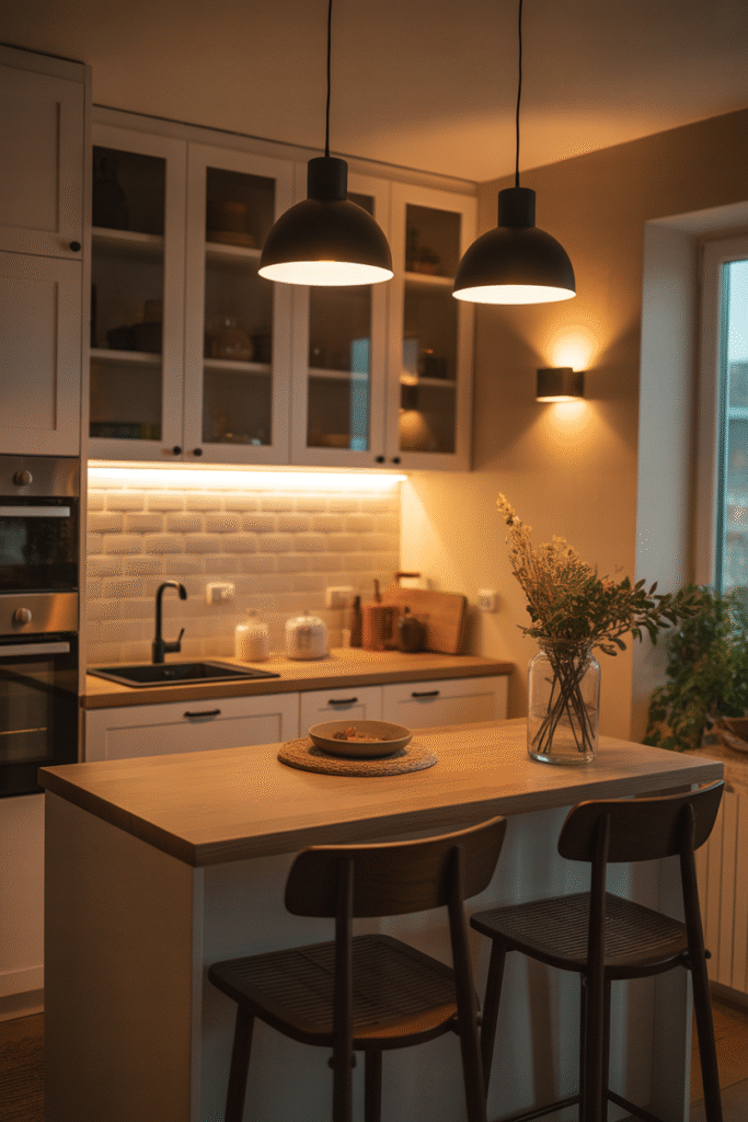
Lighting is the secret ingredient that transforms neutrals from flat to glowing. Use warm-white bulbs (2700K–3000K) to enhance the cozy undertones of cream and wood. Under-cabinet lighting, brass pendants, and a few recessed fixtures with dimmers help create depth and shadow play — essential for making a neutral palette feel dynamic.
7. Introduce a Subtle Contrast Color
Even a warm neutral kitchen needs a whisper of contrast. Try a soft clay, blush beige, or muted sage island against creamy cabinetry. These near-neutrals keep the palette calm but add gentle interest. If you prefer to stay purely neutral, use depth of tone instead — pairing light ivory with deeper mushroom or sand for a layered effect.
8. Soften Edges with Textiles and Rugs
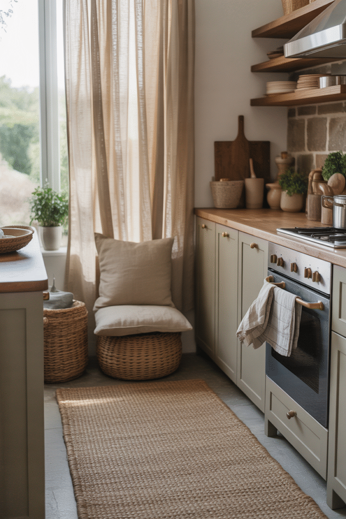
A woven runner, linen Roman shade, or nubby seat cushion breaks up the clean lines of cabinetry and stone. Look for natural fibers in oatmeal, flax, or terracotta-tinted neutrals. These accents introduce coziness, movement, and warmth without overwhelming the palette.
9. Balance Matte and Sheen Finishes
Too much matte can feel chalky, and too much gloss can feel cold. The magic is in the mix. A satin cabinet finish reflects just enough light, while a honed countertop offers contrast. Even adding a glossy backsplash tile behind the stove can subtly lift the whole room.
10. Curate Lighting Fixtures That Double as Decor
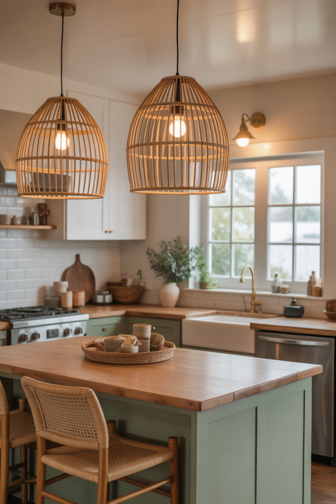
Statement lighting brings personality to an understated palette. Rattan pendants, frosted glass globes, or vintage brass sconces add sculptural form. Keep metal temperatures consistent across the space, and use warm bulb tones to maintain the inviting glow.
11. Highlight Architecture and Texture
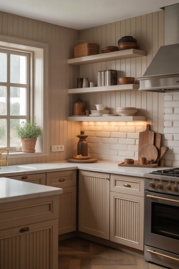
Warm neutrals love dimension. Add shallow paneling, shiplap, or fluted cabinet fronts for subtle texture. In modern kitchens, vertical grain veneer or softly curved edges on an island lend warmth and visual flow. Play with shadow — these soft contours give a neutral kitchen soul.
12. Finish with Organic Accents

Layer in the lived-in details that make a kitchen feel like home: a ceramic fruit bowl, an amber glass vase, or a linen-covered stool. Natural elements — even dried herbs or an olive branch — complement the earthy calm of a neutral palette. These quiet, organic touches are what make the space feel timeless rather than trend-driven.
Pro Tips for Getting the Palette Right
- Mind undertones: If your cabinets are creamy, skip cool whites nearby — they’ll make the cream look yellow.
- Test with lighting: Paint swatches on large boards and view them morning to evening. Warm neutrals can shift dramatically in changing light.
- Balance materials: Combine at least one soft (textile, fabric, matte paint) and one hard (stone, tile, metal) element in each sightline for visual harmony.
Why Warm Neutrals Endure
A warm neutral kitchen works in every season, every light, every style. It can skew rustic or refined, modern or traditional, and still feel timeless. These tones create calm without sterility — they soothe but never bore. When layered thoughtfully, they capture what most of us crave from a kitchen: a place that feels as good as it looks.
Final Thought:
Warm neutrals aren’t just about color — they’re about mood. They invite slow mornings, shared meals, and lasting comfort. With the right balance of tone, texture, and light, your kitchen becomes more than a cooking space — it becomes a haven.
Other Articles

11 Warm Neutral Kitchen Cabinet Shades Designers Love Right Now
12 Window Treatments to Consider When Curtains Aren’t Enough


")
")
