")
")


If the past few years have taught us anything about design, it’s that comfort never goes out of style. After a long reign of stark whites and cool grays, warm neutrals are making a confident, comforting return — and nowhere do they shine brighter than in the kitchen.
Designers are embracing shades that feel lived-in and luminous: soft creams, taupes, mushroom grays, and honeyed woods that layer beautifully under natural light. These hues invite calm and connection — they make the kitchen, the heart of the home, truly feel like home.
Whether you lean toward classic creamy whites or the quiet luxury of putty and blush beige, today’s warm neutrals offer endless ways to express personal style while keeping things timeless. Ahead, we’ll explore 11 warm neutral kitchen cabinet shades that designers can’t stop talking about — and loving — right now.
Creamy White — The Eternal Classic
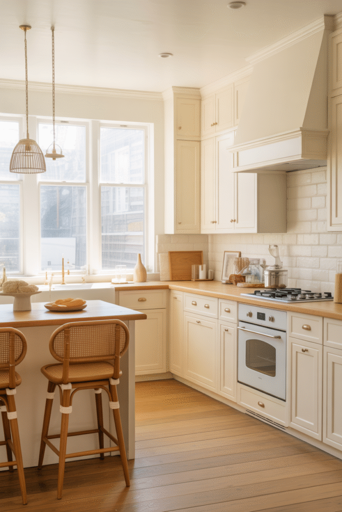
There’s something about a creamy white kitchen that never goes out of style. It’s bright yet soft, elegant yet approachable — the kind of space that feels alive no matter the time of day. Unlike stark whites that can feel clinical, creamy tones bring a gentle warmth that enhances both natural light and architectural detail.
Why Designers Love It
- Soft light reflection: Creamy whites bounce sunlight around the room, creating a glow rather than a glare.
- Versatility: They blend effortlessly with wood, stone, brass, or wicker — fitting seamlessly into modern, farmhouse, or transitional designs.
- Low maintenance: Slightly off-white tones hide smudges and wear better than pure whites.
- Timeless appeal: These shades adapt as trends shift — from rustic to refined, they remain beautifully neutral.
In the kitchen above, the cabinetry’s delicate ivory hue pairs perfectly with natural oak countertops and cane-backed barstools, balancing brightness with warmth. The subtle cream tone allows the texture of the wood and woven materials to stand out, while brass hardware and soft pendant lighting introduce a hint of polish. This palette invites you in — it’s welcoming, sunlit, and quietly luxurious.
Designer Tip
For the most flattering effect, choose a creamy white with yellow or beige undertones rather than gray. Test paint samples under your kitchen’s actual lighting, as sunlight and artificial light can shift how the color reads throughout the day.
Soft Greige — The Perfect Balance
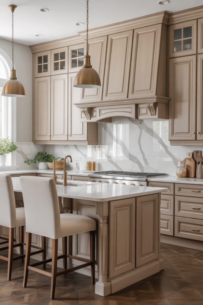
If creamy white is the classic, then soft greige is the modern essential — that subtle blend of gray and beige that somehow manages to feel both fresh and timeless. It’s the shade designers turn to when they want to bridge cool and warm tones in one elegant sweep.
This kitchen captures greige at its best: rich enough to add depth, yet airy enough to keep the room feeling open. The panelled cabinetry, finished in a smooth greige wash, pairs beautifully with brushed brass fixtures and marble veining that ties everything together. The effect is graceful and grounded — not too crisp, not too cozy, just right.
Why Designers Choose Greige
- Versatility: It plays well with any accent — from crisp white marble to walnut wood and black metal.
- Mood balance: Greige adapts easily to changing light, looking warmer in sunlight and cooler under LEDs.
- Sophisticated neutrality: It offers subtle depth and polish that pure beige or gray can lack.
In this kitchen, greige cabinetry adds a refined calm to the space. The marble backsplash introduces gentle movement, while the brass pendant lights lend warmth and visual weight. Together, they create a space that feels both classic and current — the sort of kitchen that ages gracefully as styles evolve.
Styling Inspiration
- Combine greige with brass or bronze hardware for warmth.
- Pair with white or cream countertops to keep the palette light and open.
- Add texture through woven fabrics, plants, or natural stone for dimension.
This is the color for homeowners who crave serenity but don’t want sterile — a perfect midpoint between the minimal and the homey.
Warm Taupe — Earthy and Elegant
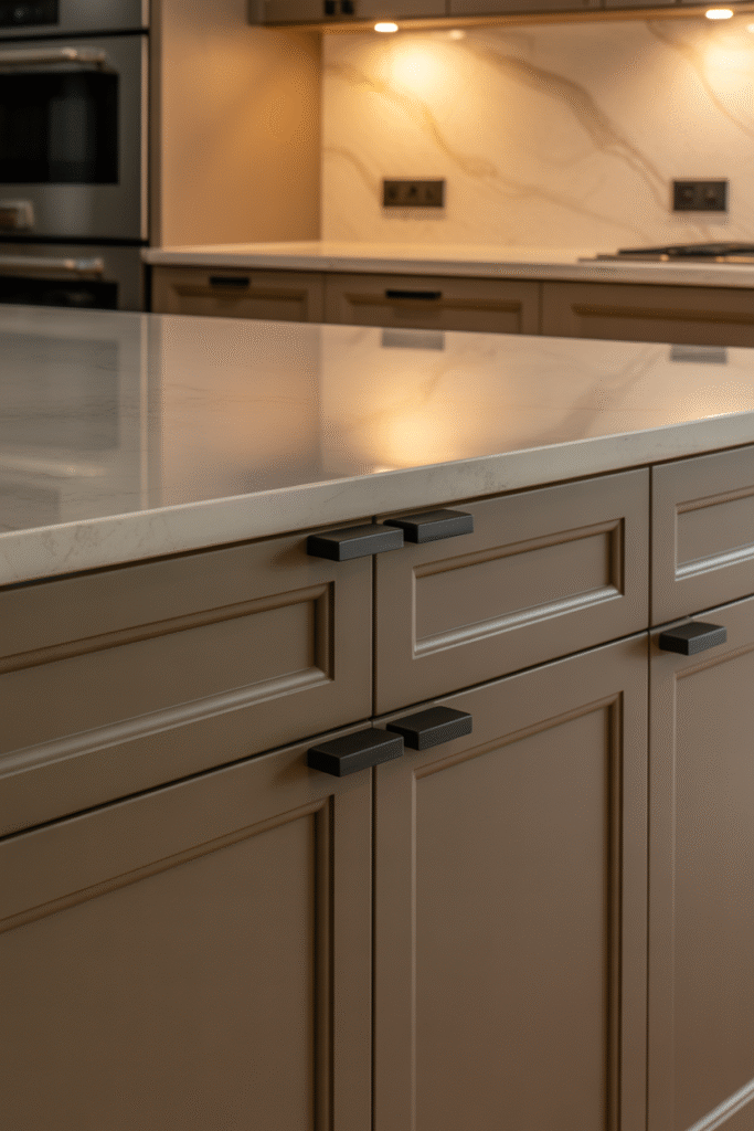
There’s a quiet confidence in warm taupe cabinetry — a color that grounds the space without overwhelming it. Somewhere between beige and mocha, taupe brings a soft, earthy depth that feels refined and enduring. Designers often reach for it when they want a neutral that carries personality — one that feels both modern and timeless.
In this kitchen, the taupe finish introduces a gentle richness that plays beautifully against creamy marble countertops and subtle lighting. The matte black hardware adds contrast and definition, proving that warm neutrals can still make a statement. It’s the kind of kitchen that feels effortlessly elegant, whether it’s styled with sleek minimalism or layered with rustic texture.
Why Warm Taupe Works So Well
- Depth and dimension: Taupe offers just enough pigment to add warmth while remaining understated.
- Lighting adaptability: Its tone can lean cooler or warmer depending on the light, which makes it a flexible choice for different home styles.
- Pairs beautifully: Works equally well with dark metals, natural woods, or creamy stone.
The soft lighting in this scene highlights taupe’s most alluring quality — its ability to shift subtly throughout the day, from soft latte tones in the morning to richer mocha hues under evening light. It’s a color that feels alive, breathing warmth into the kitchen without demanding attention.
Designer Tip
If you’re choosing taupe cabinetry, test undertones carefully. A hint of violet gives a contemporary feel, while brown or gray undertones feel classic and calming. Pair it with neutral countertops and matte finishes for the most balanced, sophisticated look.
Buttery Beige — Soft, Cozy, and Classic
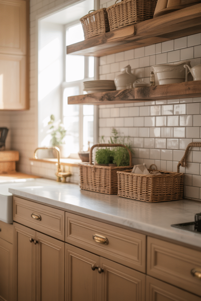
If warmth had a color, it might just be buttery beige. There’s an effortless comfort to this shade — a softness that makes a kitchen feel immediately welcoming. It’s the hue of morning sunlight spilling across a wooden table, of baked bread cooling on the counter. Designers love it because it feels lived-in, layered, and naturally cozy without veering into yellow or brown.
In this kitchen, the buttery beige cabinetry pairs beautifully with textured white subway tile and open wooden shelving, creating a balance between classic charm and everyday function. The woven baskets, brass hardware, and green herbs on the counter complete the picture: a space that feels both organized and warmly personal. This is a kitchen that says, “Stay awhile.”
Why Buttery Beige Works in Any Home
- Softens strong light: Ideal for bright kitchens where white might feel too stark.
- Pairs with texture: Complements rattan, linen, and light oak beautifully.
- Classic yet current: Its subtle warmth fits farmhouse, traditional, or boho-inspired spaces alike.
- Invites calm: It’s a hue that soothes without dulling the energy of the room.
Notice how the sunlight here brings out a gentle golden undertone, which harmonizes with the warm wood shelving and aged brass fixtures. The result is timeless — a room that feels as fresh today as it might have fifty years ago.
Designer Tip
To keep beige cabinetry from feeling flat, pair it with contrasting textures — think handmade tiles, natural stone, or matte hardware. And don’t be afraid to layer in greenery; plants bring out the organic side of the palette and keep the space feeling alive.
Mushroom Gray — Subtle and Sophisticated
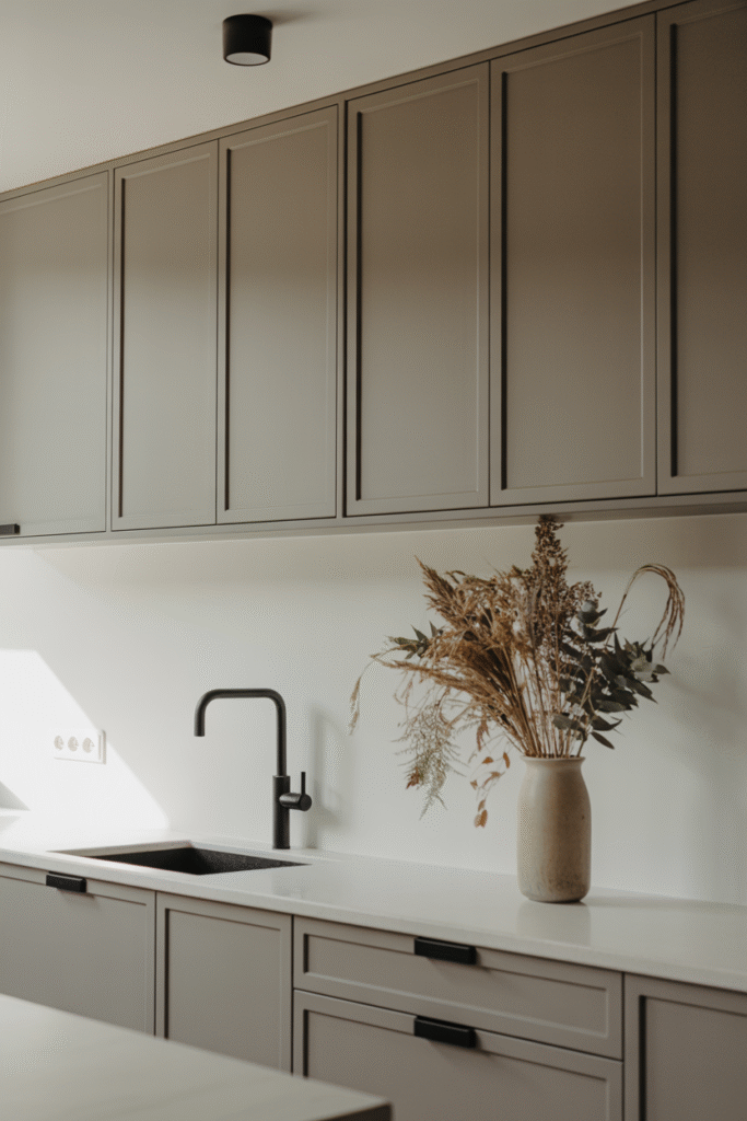
If neutrals had a secret weapon, it would be mushroom gray — a tone that bridges warmth and coolness so gracefully that it almost defies category. It’s gray, yes, but with a whisper of brown that adds depth and calm. This shade doesn’t shout for attention; instead, it anchors the room in quiet sophistication.
In this kitchen, the matte mushroom cabinetry exudes understated confidence. Paired with a crisp white countertop and matte black fixtures, it creates a modern yet inviting balance. The clean lines and minimalist styling allow the color itself to take center stage — a perfect match for those who love simplicity without sterility.
Why Designers Choose Mushroom Gray
- Perfect neutrality: It complements warm woods and cool metals equally well.
- Timeless versatility: Works beautifully in both classic and contemporary spaces.
- Elegant restraint: Offers visual softness while maintaining a polished, architectural look.
The dried floral arrangement in this kitchen adds a touch of organic warmth, contrasting gently with the cabinetry’s smooth finish. Together, they capture what mushroom gray does best — balancing nature and modernity, texture and tone. It’s the kind of color that feels quietly luxurious, like linen or stone, rather than painted on.
Designer Tip
Mushroom gray thrives with natural light. In dim or windowless spaces, use warm under-cabinet lighting to bring out its earthy undertones. For contrast, pair it with black accents — faucets, handles, or lighting — to emphasize the sleek, modern lines.
Clay or Terracotta — Earth-Inspired Warmth
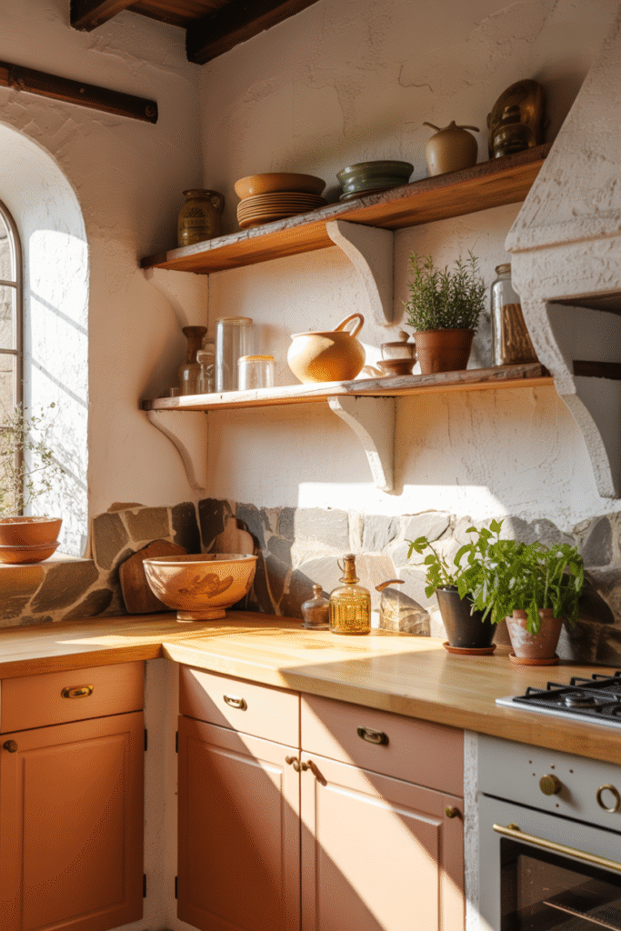
Few shades capture the soul of nature quite like clay and terracotta. These hues, drawn from sun-baked soil and handmade pottery, infuse a kitchen with warmth that feels both rustic and refined. They tell a story of craft and comfort — of meals shared, herbs drying by the window, and sunlight slipping across textured walls.
In this kitchen, the terracotta cabinetry radiates organic warmth beneath a soft golden light. The wooden countertops and open shelving echo the color’s earthy character, while stone accents and hand-thrown pottery add a tactile authenticity. Every detail contributes to a Mediterranean ease — relaxed yet full of personality.
Why Designers Love Clay & Terracotta
- Organic energy: These tones instantly make a space feel grounded and connected to the natural world.
- Warm contrast: They balance beautifully against cool stone or crisp white plaster.
- Rich texture: Clay shades enhance tactile materials like wood, jute, and ceramics.
- Mood-boosting: The undertones of red and orange subtly energize without overwhelming the senses.
Here, the sunlight deepens the cabinetry’s tone, highlighting its natural warmth while green herbs and earthen jars keep the look fresh and alive. It’s a kitchen that feels crafted, not manufactured — a place where imperfections and texture are part of the beauty.
Designer Tip
For a balanced palette, pair terracotta cabinetry with neutral walls and warm metals such as aged brass or brushed gold. To enhance depth, introduce soft white plaster finishes or stone tile backsplashes that echo the natural materials found in this color’s origin story.
Honeyed Oak — Natural Wood Warmth
There’s a comforting nostalgia in honeyed oak cabinetry, a tone that instantly warms a kitchen with its natural glow and visible grain. It’s a look that feels handcrafted and enduring — like a nod to classic design reimagined for modern living. Oak brings not just color, but character — every swirl and knot telling its own story.
In this kitchen, the honey-toned oak cabinets gleam under natural light, their grain catching the sun in golden streaks. The soft cream countertops and vintage-style brass pulls lend an old-world charm that feels both inviting and timeless. This is the kind of kitchen that hums with quiet familiarity — where everything has a place, and mornings begin with warmth.
Why Designers Love Honeyed Oak
- Natural texture: The visible grain adds visual interest and tactile appeal.
- Warmth without heaviness: Lighter than walnut or mahogany, yet still rich and substantial.
- Pairs beautifully: Works with creams, whites, and even muted greens for a balanced palette.
- Sustainably timeless: Real or stained oak brings organic authenticity that never feels dated.
The sunlit finish here enhances oak’s honey-like undertones, proving how effective natural wood can be as both color and material. Its glow invites comfort — the same kind that comes from a favorite wooden table or a home-cooked meal.
Designer Tip
To keep oak cabinetry fresh and modern, balance its warmth with cooler or neutral surfaces — think creamy quartz countertops or matte brass hardware. If you love a layered look, add woven textures or ceramic accents for an organic finish that celebrates oak’s natural heritage.
Almond or Latte — Cozy Neutrals with Depth
For those who crave warmth without the intensity of darker wood tones, almond and latte shades strike the perfect chord. These hues bring the comfort of a morning cappuccino into the kitchen — soothing, familiar, and quietly sophisticated. They’re neutrals with soul: richer than beige, softer than brown, and endlessly livable.
In this kitchen, the latte-toned cabinetry feels buttery and tactile under the golden light. Paired with warm metallic fixtures and a creamy stone backsplash, it creates an atmosphere of subtle luxury. The result isn’t flashy; it’s deeply comforting, like the hum of a slow morning or the glow of late afternoon sun filtering through the window.
Why Designers Love Almond & Latte Tones
- Layered warmth: Adds depth and coziness to open layouts without feeling heavy.
- Flattering contrast: Blends beautifully with white, cream, or even darker walnut finishes.
- Timeless and versatile: Works across rustic, transitional, or minimalist styles.
- Inviting mood: These tones bring an organic calm that enhances everyday rituals.
Here, the soft metallic faucet and vintage-style knobs echo the latte cabinetry’s undertones, creating a cohesive, monochromatic palette. The combination feels modern yet rooted — elegant enough for a designer home, but relaxed enough for daily life.
Designer Tip
Keep the look sophisticated by mixing matte and polished finishes — for instance, matte cabinetry paired with a subtly veined countertop or brushed gold hardware. Add ceramic or glass décor in creamy neutrals to enhance the layered warmth of the space.
Putty — Understated and Modern
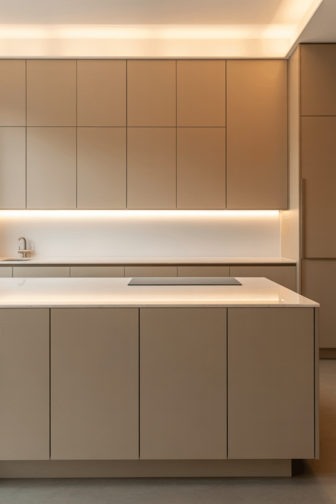
Sleek, subtle, and effortlessly elegant — putty is the shade that defines quiet luxury. It’s a neutral that sits between beige and gray, offering the perfect balance of warmth and restraint. Designers often describe it as architectural, a tone that supports form and light rather than competing with them. In the right space, putty cabinetry feels both calm and contemporary, like a perfectly tailored suit for your kitchen.
In this kitchen, the matte putty cabinets stretch from floor to ceiling, creating a seamless, sculptural effect. The under-cabinet lighting casts a soft, golden glow across the minimalist surfaces, highlighting the color’s refined undertones. There’s no visible hardware, no excess ornamentation — just clean lines and balance. It’s the kind of space where less truly feels like more.
Why Designers Choose Putty
- Timeless minimalism: Perfect for modern interiors that favor simplicity and structure.
- Layered neutrality: Pairs equally well with soft whites or darker accents.
- Soft sophistication: The matte finish keeps the look warm, not sterile.
- Mood adaptability: Looks elegant in both natural daylight and warm artificial lighting.
The restrained palette allows the materials and light to shine. A subtle stone countertop and hidden fixtures add quiet luxury, while the continuous plane of cabinetry expands the sense of space. It’s peaceful, precise, and intentional — a reminder that sometimes, beauty lies in restraint.
Designer Tip
To make a putty-toned kitchen feel inviting rather than austere, play with lighting temperature — warm LED strips or pendant lights can add dimension and coziness. Pair it with natural textures like linen barstools or light wood flooring to soften the modern edges without losing that clean architectural feel.
Blush Beige — A Hint of Rosy Warmth
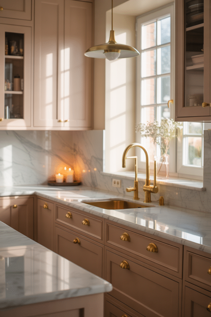
If you’re drawn to neutrals but long for a little romance, blush beige might be your perfect match. It’s a hue that whispers rather than shouts — soft, luminous, and full of warmth. Designers adore this tone because it bridges classic elegance with a subtle modern twist, adding a hint of personality without overwhelming the space.
In this kitchen, the blush-beige cabinetry glows in the afternoon light, its gentle pink undertone beautifully complemented by brushed brass fixtures and marble surfaces. The result is quietly luxurious — a space that feels calm, but never cold. Candles flicker by the window, enhancing the rosy hue and bringing out its natural depth.
Why Designers Love Blush Beige
- Romantic neutrality: A modern alternative to traditional creams and tans.
- Soft radiance: Reflects light beautifully, adding a healthy, warm glow to the space.
- Pairs effortlessly: Looks stunning with gold, marble, or natural stone.
- Elevated charm: Feels contemporary yet timeless, especially in transitional designs.
The key to blush beige’s appeal is restraint — the color carries emotion without tipping into overt femininity. The marble backsplash and muted brass lighting in this space keep the palette grounded and sophisticated. It’s the perfect choice for homeowners who want a touch of color, but still crave the versatility of a neutral.
Designer Tip
To make blush beige shine, pair it with warm metallics and natural light. A mix of matte and reflective surfaces — marble, satin brass, or glass — enhances its dimensionality. It’s also beautiful in candlelight, making it ideal for kitchens that double as cozy entertaining spaces.
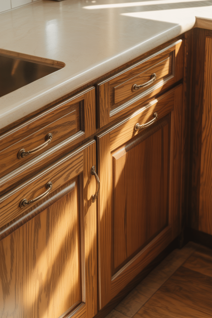
Caramel or Maple — Rich, Comforting Tones
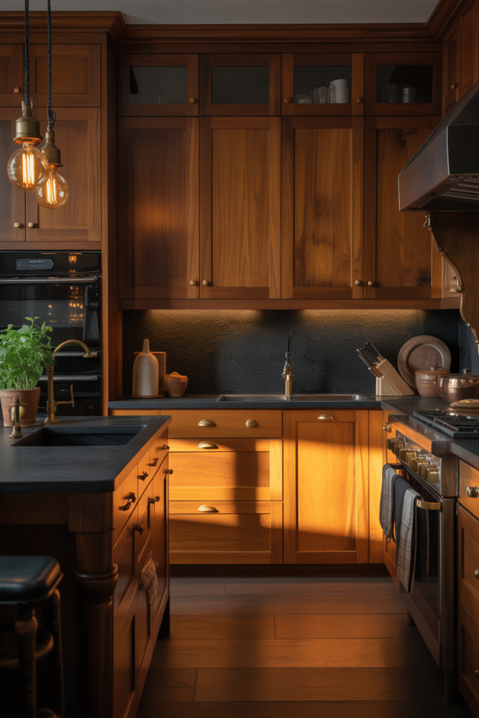
There’s something irresistibly grounding about caramel and maple cabinetry — rich, golden-brown hues that bring warmth, depth, and a touch of nostalgia to any kitchen. These tones remind us of aged wood furniture and cozy evening light — timeless elements that feel both traditional and luxuriously modern when paired with the right materials.
In this kitchen, the caramel-toned wood cabinetry glows beneath warm pendant lighting, its surface catching light like liquid amber. The black stone countertops provide a sophisticated contrast, while brass hardware enhances the richness of the wood’s natural grain. Together, they create a look that’s both strong and soft — comfort with character.
Why Designers Love Caramel & Maple Finishes
- Depth and warmth: These tones make even large kitchens feel intimate and inviting.
- Natural luxury: Rich wood finishes instantly elevate the space without relying on ornamentation.
- Versatility: Works beautifully with dark accents, warm metals, and moody lighting.
- Long-lasting appeal: Like fine leather or hardwood flooring, it only gets better with age.
Here, the subtle sheen of the cabinetry complements the room’s moody black backsplash, creating visual drama while maintaining balance. It’s the ideal palette for those who crave a kitchen that feels like a gathering place — warm, layered, and full of life.
Designer Tip
To modernize caramel or maple cabinetry, introduce matte finishes and sleek black or brass fixtures for contrast. Pair with stone or concrete countertops to balance the warmth with a touch of contemporary cool. And don’t underestimate lighting — ambient, low-temperature bulbs can make the wood’s tone glow like sunset.
Conclusion: Where Warmth Meets Timeless Style
Warm neutrals aren’t just a color choice — they’re a feeling. They bring ease to everyday spaces, connecting us back to what matters most: comfort, texture, light, and belonging. Each tone — from soft greige to caramel maple — tells its own story, layering depth and warmth without demanding attention.
The beauty of these hues lies in their adaptability. They blend effortlessly across styles — farmhouse, modern, coastal, or traditional — aging gracefully as trends come and go. Paired with natural materials, warm metals, and thoughtful lighting, they create kitchens that invite gathering, reflection, and joy.
In a world that moves fast, a warm neutral kitchen slows things down — reminding us that design isn’t just about how a space looks, but how it makes us feel. And right now, the feeling everyone wants is warmth.
Other Articles

12 Warm Neutral Kitchen Ideas for a Cozy, Timeless Look

")
")

