")


(Layouts, zoning tricks & real-measurements to make it feel big even when it isn’t)
Picture this: you walk into your compact flat, and instead of bumping into furniture or feeling boxed in, you breeze through a clever interplay of kitchen and living room space that flows. You glance from your sofa to the cooking zone and realise: Yes—this works. Because you designed it to work. I’ve been there (thank you 37 m² studio), and so have countless others. Small-space living doesn’t mean giving up style or function—it means getting smart.
Below are 10 combos designed for the small living room–kitchen scenario (think: apartment, loft, or modest open-plan space). I’ll walk you through each idea, share when it works best, give you real-world measurements and budget tiers, and a few pro tips I learned the hard way. Ready? Let’s dig in.
1. One-Wall Kitchen + Floating Sofa Zone

When it works:
You’ve got a narrow width (~2.5–3 m) and want to keep sightlines open.
The layout:
- Kitchen runs along one wall; aim for ~240–300 cm run.
- Counter height at ~90 cm, leaving a clear walkway of ~90–100 cm in front.
- Opposite the run, a sofa backs onto the wall or floats slightly away (~30 40 cm) to widen viewing angle.
- Between them, a slim rug (e.g., 160×230 cm) anchors the living zone without blocking flow.
Budget-tiers:
- Good: stock 600 mm cabinets + laminate worktop.
- Better: 550 mm deep base units + under-lighting.
- Best: full height gloss units + integrated panel appliances.
Pro tip:
Use the same flooring across both zones so the room appears larger. Then break the kitchen zone with a narrow colour band or backsplash accent.
Why it’s smart:
It keeps everything in view, supports natural light (no high partitions), and the living zone feels part of the whole—rather than squeezed off.
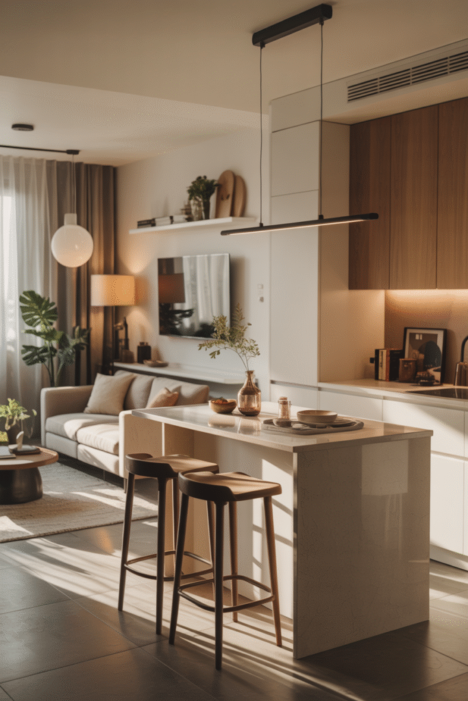
2. Peninsula as Visual Divider (with Bar-Stool Seating)
When it works:
You’ve got a bit more width (≈3–3.5 m) and want to subtly separate zones without walls.
The layout:
- Use a peninsula ~120–140 cm long and ~60 70 cm deep.
- Overhang one side for bar-stools (seat width ~60 cm each).
- On the living-room side place a 2-3 seater sofa parallel to the peninsula.
Budget-tiers:
- Good: IKEA kitchen units + 30 mm worktop + 2 basic metal stools.
- Better: real wood veneer front + waterfall edge + quality upholstery.
- Best: stone worktop, built-in side storage, custom stools, seamless transition to sofa back.
Pro tip:
Keep peninsula height the same as counter height (90 cm) so it functions for cooking prep AND casual dining. Add toe-kick LED to give a floating effect.
Unique benefit:
The peninsula becomes both a kitchen workspace and a seating divider—less bulk, more purpose.
3. Pocket Door or Sliding Panel Between Zones
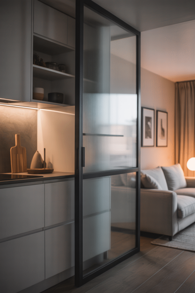
When it works:
You want flexibility: open for flow, closed for quiet or cooking fumes.
The layout:
- A sliding or pocket door (glass or frosted) mounted between kitchen and living.
- Kitchen may be one-wall or L-shape; living area beyond.
Budget-tiers:
- Good: standard sliding barn-door hardware + frosted glass.
- Better: flush hardware, track hidden in ceiling, acoustic paneling.
- Best: motorised door, full-height glazing, integrated blinds.
Pro tip:
Choose translucent rather than fully opaque glass so light still passes through. It keeps both zones bright.
Why it adds value:
It gives the feel of separate spaces when needed yet opens up into one fluid area when you want space to breathe.
4. Zoning with Rugs, Lighting & Colour (No Walls)
When it works:
Your space is roughly square (≈3.5 × 3.5 m) and you want to maintain openness.
The layout:
- Use same floor material throughout.
- In living zone: define with rug (say 200×300 cm) and floor-lamp.
- In kitchen zone: hanging pendant lights & slightly different paint tone (e.g., warm neutral vs cooler neutral).
Budget-tiers:
- Good: one large rug + two pendant lights.
- Better: custom lighting scheme + textured rugs + accent wall.
- Best: integrated lighting with dimmer zoning, custom colour palette.
Pro tip:
Use a repeated accent colour in both zones (for example: cushion + stool) to visually knit the space together.
Why it works:
Your eye sees subdivision without obstruction—so the space looks intentional, not overcrowded.
5. L-Shape Kitchen + Couch Facing the Cook

When it works:
You have a deeper room (~4 m) and want living and cooking to happen in conversation.
The layout:
- One wall (≈240 cm) hosts base and wall units.
- Perpendicular return (~140–160 cm) acts as partial divider or prep area.
- Couch placed facing the main wall; sofa-to-kitchen distance ~210–250 cm.
Budget-tiers:
- Good: standard cabinets in two runs; basic sofa.
- Better: integrated appliances, grey/wood contrast fronts; plush sofa.
- Best: waterfall edge on return, stools tucked underneath, custom sofa plan.
Pro tip:
Make sure the return doesn’t block access—leave ~90 100 cm walkway at end of sofa.
Why it’s effective:
The cook doesn’t feel isolated, the living zone shares the space, and the L shape gives a partial boundary.
6. Studio-Smart: Multi-Functional Furniture + Hidden Storage
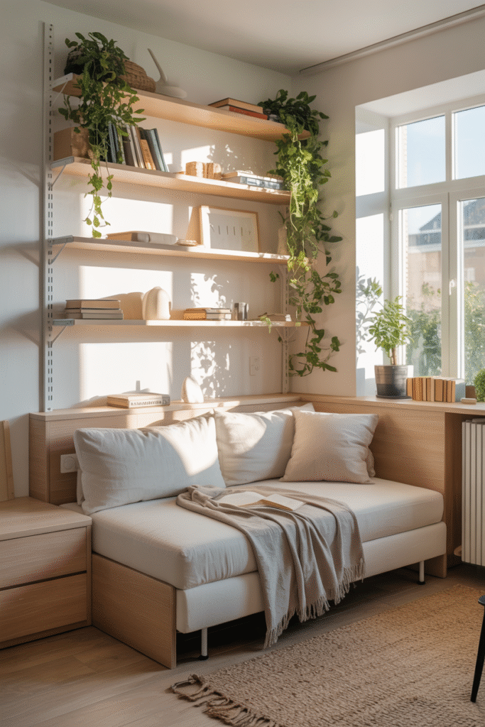
When it works:
Your space is very compact (≤30 m²) and every inch counts.
The layout:
- Use kitchen run and fold-down dining table or pivot island.
- Sofa doubles as guest bed; ottoman as coffee table/storage.
- Use overhead cabinets or shelves up to ~230 cm ceiling height.
Budget-tiers:
- Good: slim pull-out pantry + drop-leaf table.
- Better: island with hidden TV drawer + modular sofa.
- Best: fully custom joinery, integrated appliances, fold-away furniture.
Pro tip:
Use vertical “third wall” storage (ceiling-high shelving) to free up floor space. Also choose base units no deeper than 55 cm to widen walkways.
Why it matters:
In a micro space, zoning becomes furniture-function, not just layout. You get more with less.
7. Mirrored or Reflective Kitchen Backsplash to Expand Perception
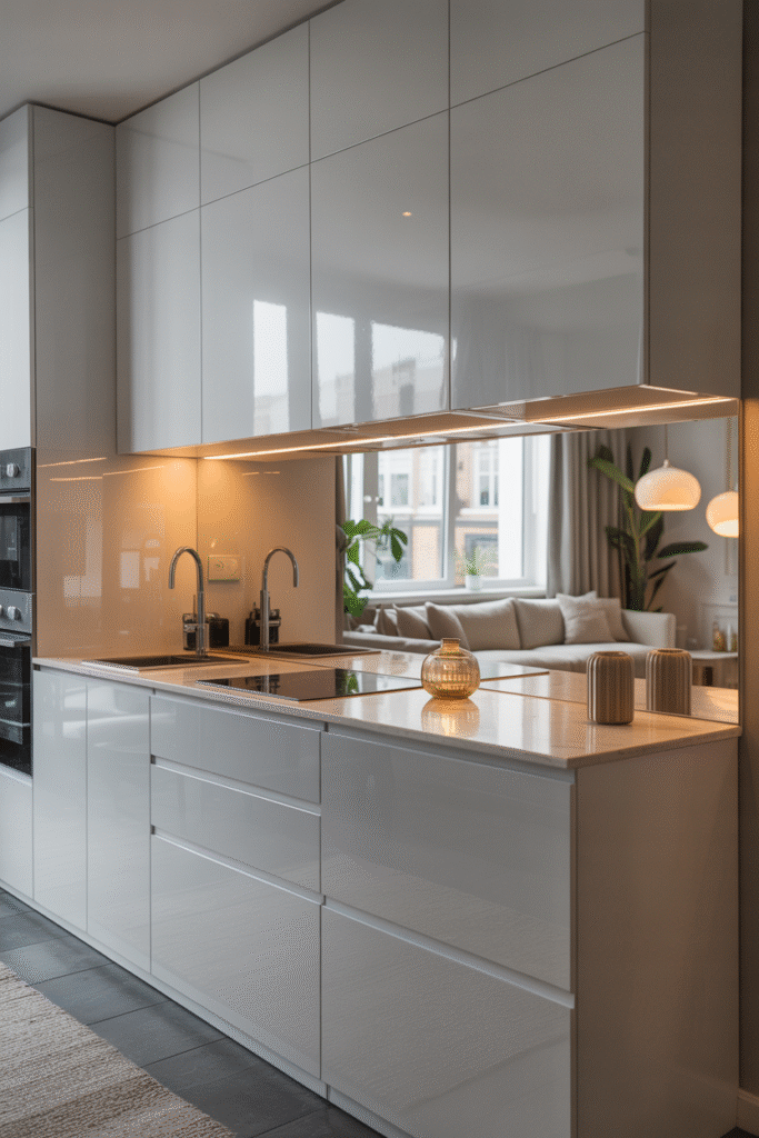
When it works:
Your window may be modest, or one zone lacks light—so you want brightness.
The layout:
- Keep kitchen run minimal.
- Choose high-gloss or mirrored tile/backsplash (height ~60–70 cm).
- Place living furniture opposite so reflection amplifies depth.
Budget-tiers:
- Good: high-gloss subway tile.
- Better: mirrored tile or stainless splash with seamless joints.
- Best: full mirror panel early behind cooktop (with integrated hood vent).
Pro tip:
Use lighting above the backsplash (linear LED) to bounce light into living zone.
Why it works:
Visual reflection tricks the eye into believing the space continues—especially handy when one zone lacks big windows.
8. Continuous Flooring + Unified Colour Palette
When it works:
You want simplicity, calm, and a feeling of “bigger than you are”.
The layout:
- Use same flooring (e.g., 150×600 mm plank) across kitchen & living.
- Choose three major colours: base/neutral, accent, metallic/wood—repeat them in both zones.
Budget-tiers:
- Good: laminate or engineered wood consistent throughout.
- Better: real wood or large format tile with underfloor heating.
- Best: custom colour-matched kitchen fronts + continuous stone flooring.
Pro tip:
Keep skirting boards minimal (≈50 mm high) so the floor appears to “flow” into walls.
Why it matters:
No visible break = seamless space. It feels larger, cleaner, and more intentional.
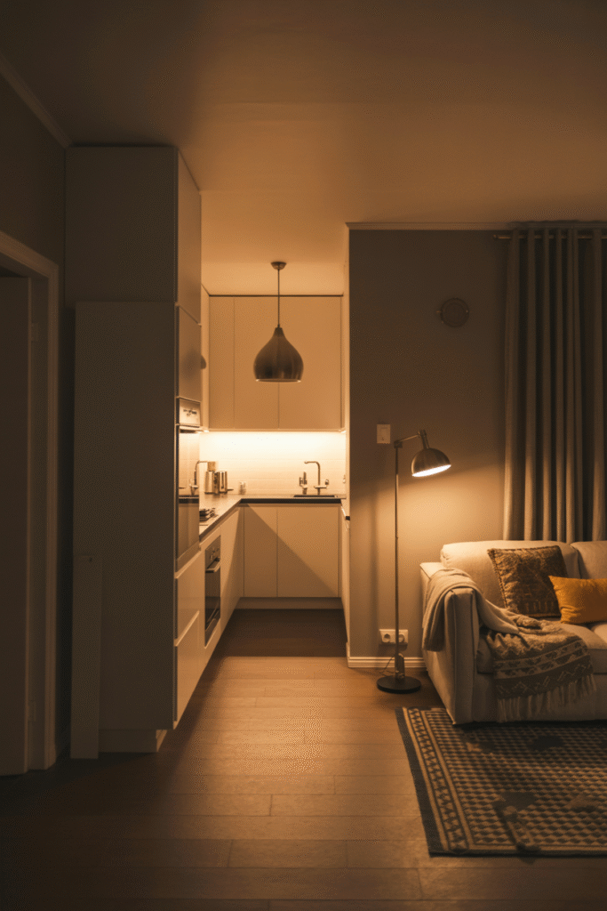
9. Acoustic & Ventilation Planning (often forgotten!)

When it works:
Your kitchen opens directly into your living room—so smells, noise, divergence matter.
The layout:
- Choose rangehood with adequate CFM rating (for ~25–30 m² space aim ~350–400 CFM).
- Use acoustic textiles in living zone (curtains, rug, upholstered furniture) to absorb sound.
- Keep pathway free (~90 cm) so traffic doesn’t cut through living zone.
Budget-tiers:
- Good: standard hood + rug + curtains.
- Better: quiet hood (≤50 dB), acoustic panels behind TV wall.
- Best: dedicated ventilation duct + invisible acoustic ceiling panels + smart airflow sensor.
Pro tip:
Place living furniture away from direct cook-zone fumes (Tv wall ~ 200 cm away) and avoid sofas with open backs facing stove.
Why it’s critical:
Without this, your cosy zone becomes cluttered with noise, grease, or cooking smells—ruining the smart feeling.
10. Flexible Dining/Prep Furniture That Doubles as Divider

When it works:
You don’t have a separate dining room; want furniture to multitask and adapt.
The layout:
- Use a narrow table/console (~120–140 cm long, ~60 cm deep) between kitchen and living.
- On kitchen side: chairs/stools; on living side: maybe storage or a laptop desk.
Budget-tiers:
- Good: basic table + stools.
- Better: extendable table + cabinet underneath.
- Best: built-in furniture that flips from dining table to desk/in-island, with soft-close drawers.
Pro tip:
Make sure chairs/stools can tuck fully underneath to preserve clear walkways of ~90–100 cm.
Why it’s clever:
One piece of furniture, two (or three) functions: dining, prep, work—not explosion of pieces.
Final Thoughts & Next Steps
You’ve just walked through 10 smart combos for small living room–kitchen layouts that don’t compromise style or practicality. The big takeaway? Intentional design beats big square metres. Whether you lean on zoning with rugs and lighting, use a peninsula to bridge zones, or deploy hidden storage and acoustic planning—you’re creating a space that works.
Here’s what I suggest you do next:
- Grab your room’s measurements: width, length, ceiling height.
- Pick one of the layouts above that fits your width & flow.
- Sketch it roughly (paper, whiteboard or digital) and mark furniture clearances.
- Choose one budget tier and make a shopping list (furniture + lighting + storage).
- Finally, pick one personality touch (accent colour, mirrored backsplash, acoustic panel) to make the space yours.
So—what’s your take on this? Ready to turn that tiny combo into a smart, stylish zone you love? I’m confident you’ll get there—and have fun doing it.
Other Articles
12 Effortless Open Kitchen–Living Room Ideas

")


